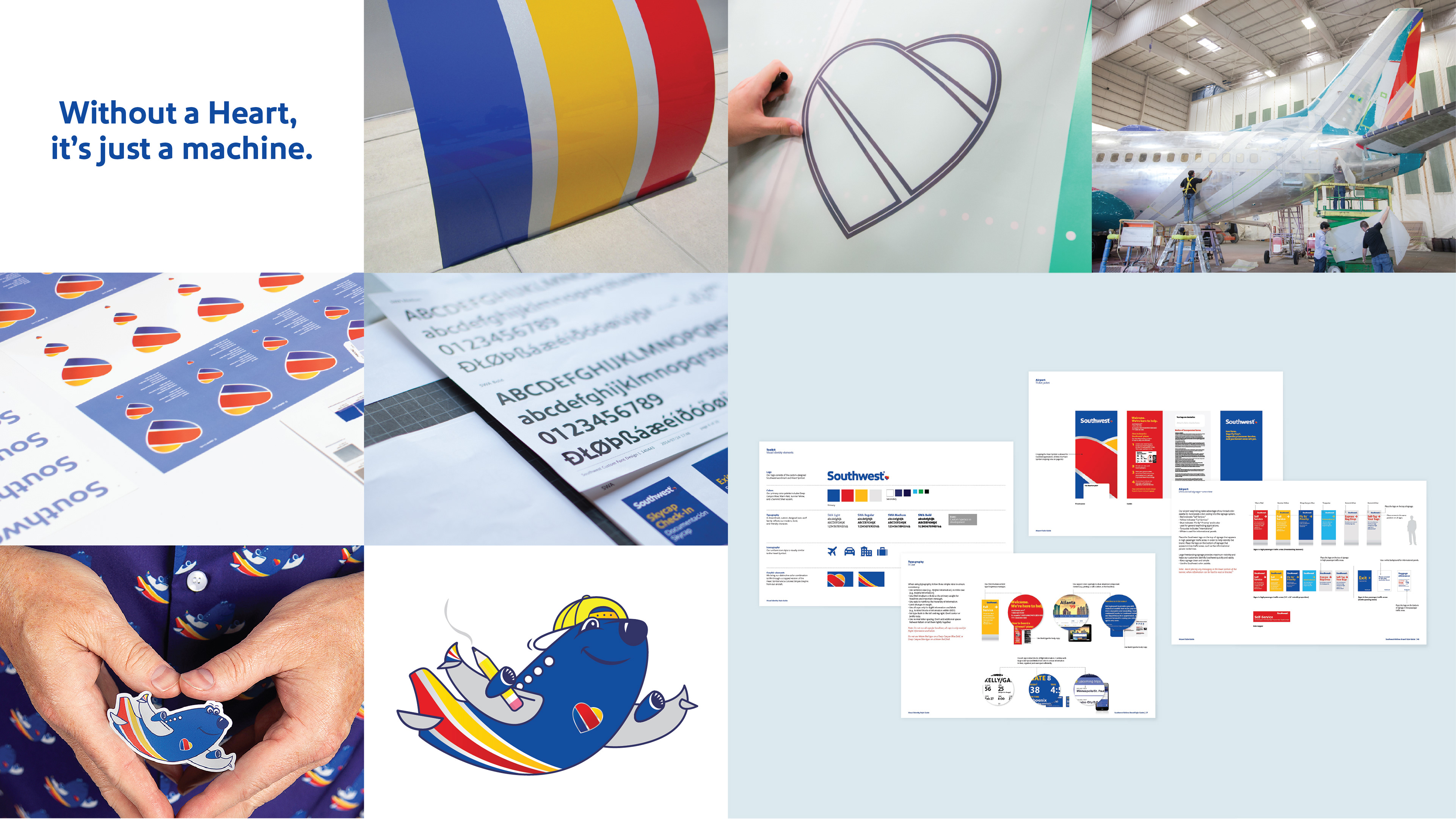
Southwest Airlines
Getting to the heart of one of America’s greatest brands.
Getting to the heart of one of America’s greatest brands.
The task was to distill more than 40 years of Southwest’s history into a single modern, impactful look that represents the exciting future of a one-of-a-kind airline.
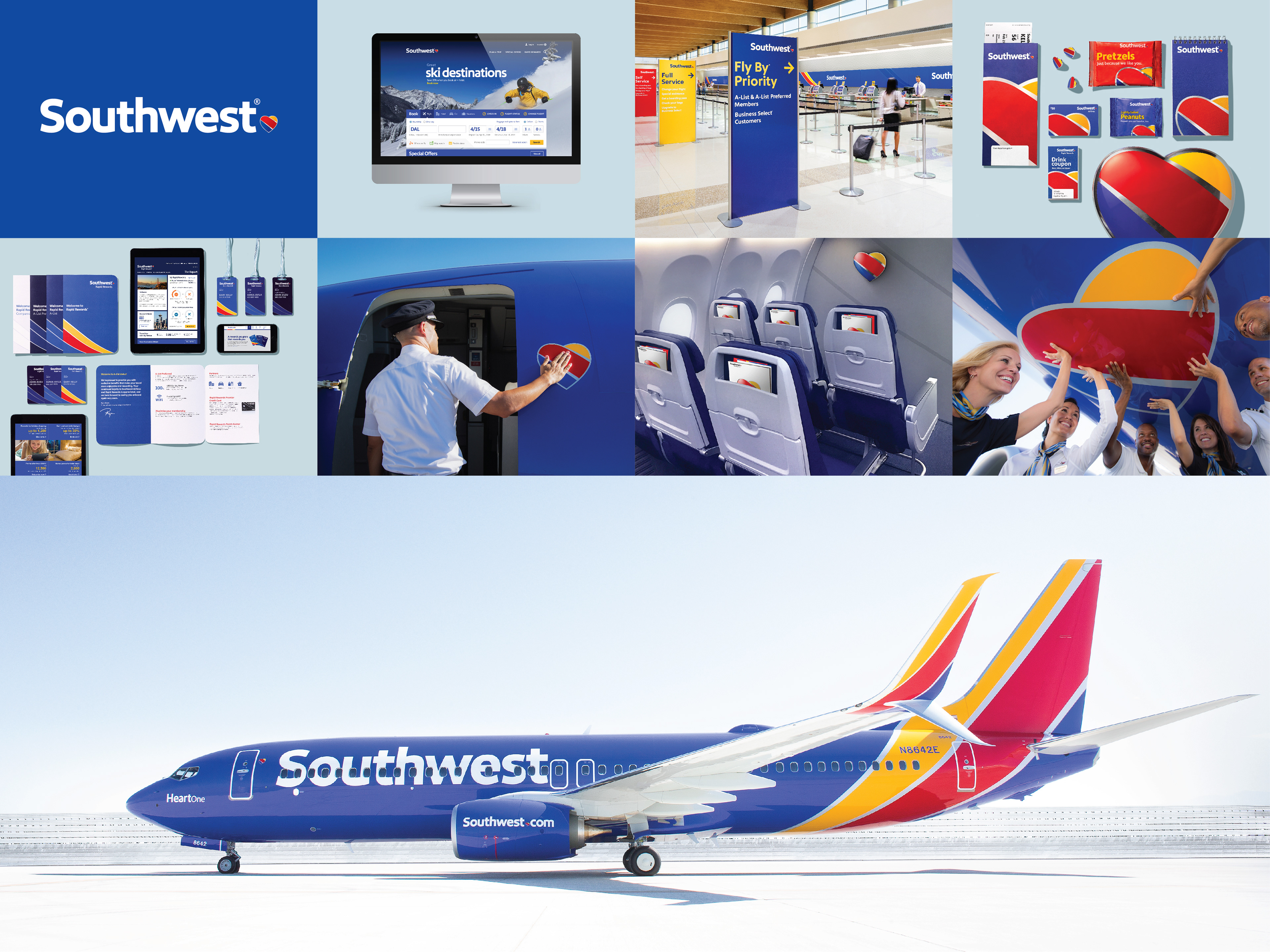
“The Heart emblazoned on our aircraft, and within our new look, symbolizes our commitment that we’ll remain true to our core values as we set our sights on the future.”
Gary Kelly
Chairman, President, and CEO, Southwest Airlines
Chairman, President, and CEO, Southwest Airlines
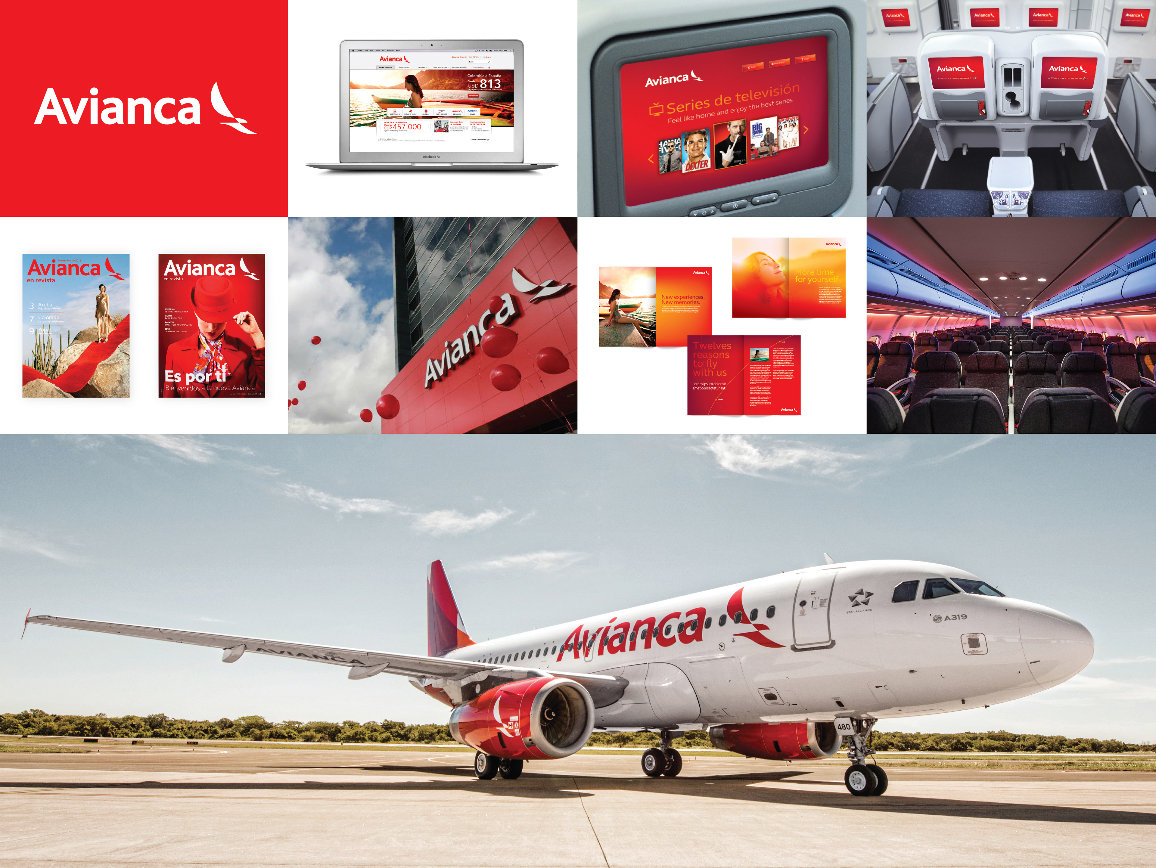
Avianca Airlines
Latin Excellence.
Latin Excellence.
In creating the visual identity, it was important to reflect the heritage and legacy of both Avianca and TACA, but also signal that this is a new, pan-Latin American Avianca. This work included a new logo, brand architecture system, livery, and visual system. The new identity was built on the symbolic power of the Condor, a symbol long associated with Avianca but now in a modern form that figuratively links South, Central, and North America. Additional design elements included aircraft interiors, various mood lighting schemes, and other experiential details that brought the new brand to life.
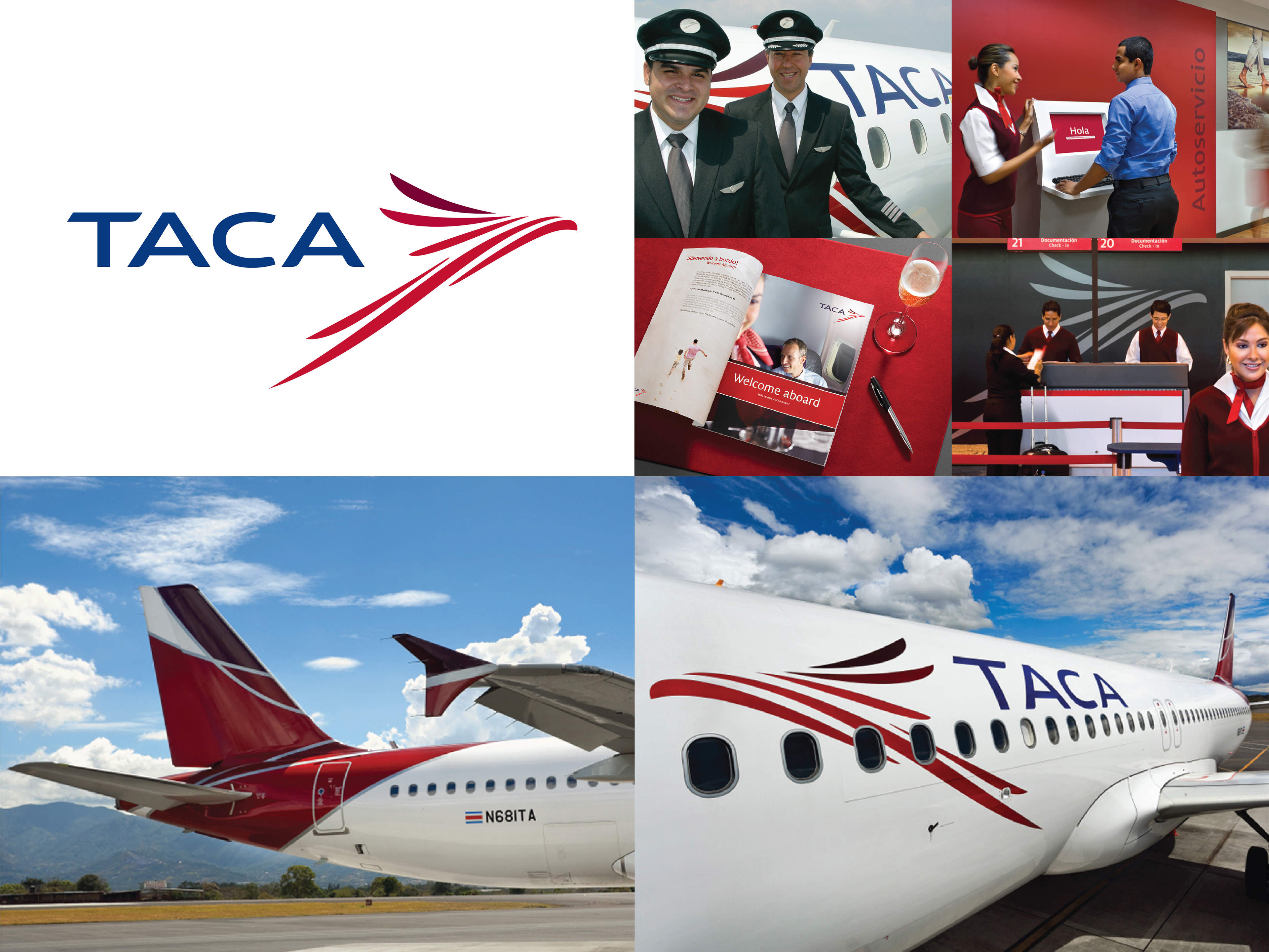
Taca Airlines
The world-class airline for the modern Latin American traveler.
In 2008, TACA undertook a strategic brand refresh to modernize the airline’s identity ahead of its regional expansion and eventual alliance with Avianca. The redesign introduced a bold wordmark and symbol intended to express energy, optimism, and forward momentum—moving away from a more traditional aviation aesthetic toward a contemporary, confident Latin American carrier. The identity emphasized simplicity and clarity across touchpoints, from aircraft livery to airport environments and communications, positioning TACA as a unified regional brand with global ambition.
In 2008, TACA undertook a strategic brand refresh to modernize the airline’s identity ahead of its regional expansion and eventual alliance with Avianca. The redesign introduced a bold wordmark and symbol intended to express energy, optimism, and forward momentum—moving away from a more traditional aviation aesthetic toward a contemporary, confident Latin American carrier. The identity emphasized simplicity and clarity across touchpoints, from aircraft livery to airport environments and communications, positioning TACA as a unified regional brand with global ambition.
Contact us at info@pencilworx.com