
PROJECT SUMMARY
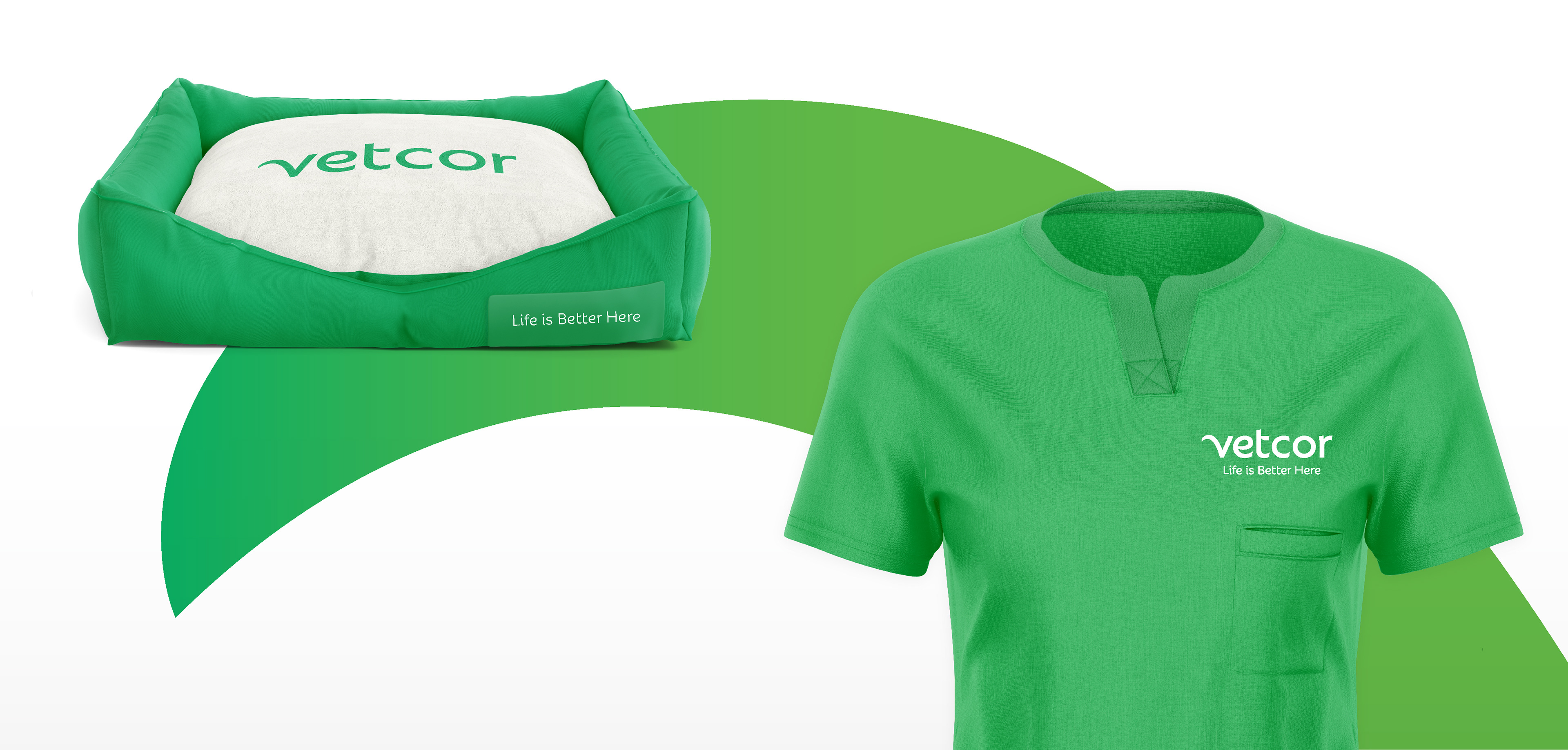
Life is Better Here
Life is Better Here
SITUATION
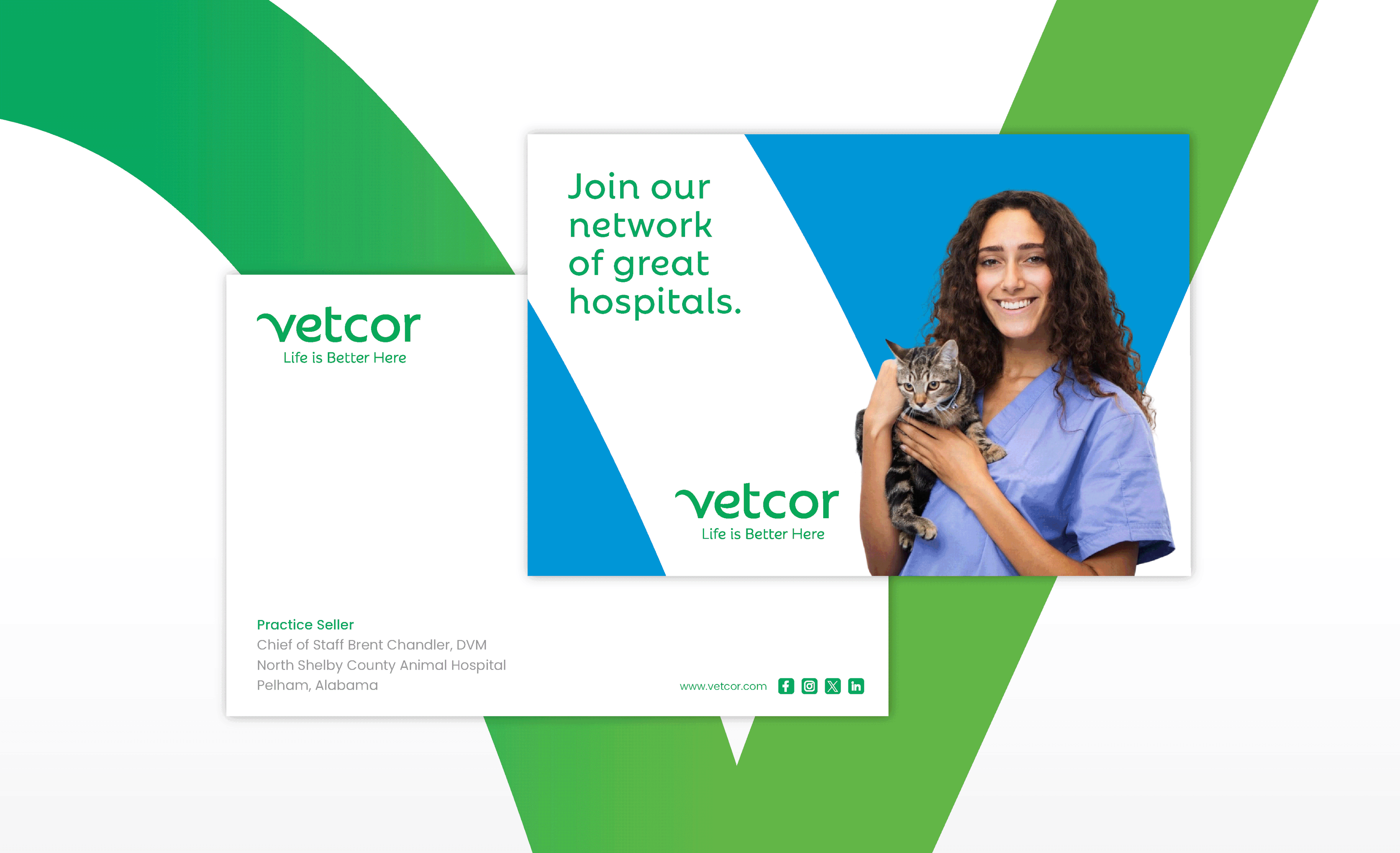
Vetcor is a national network of community-based veterinary practices supporting the people who care for our pets.
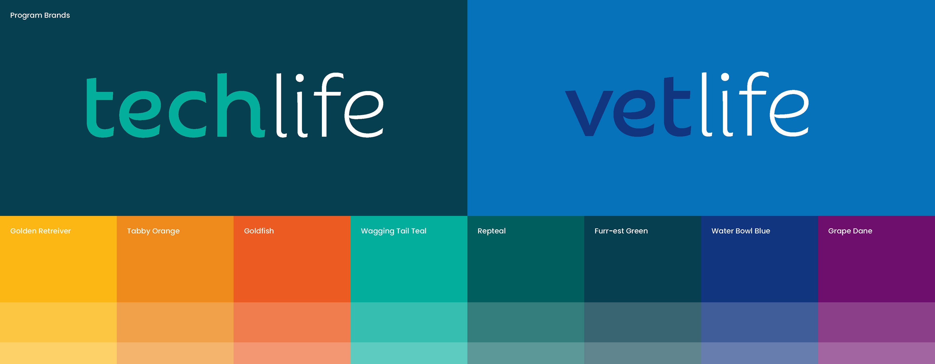
With more than 800 practices across the country, the rebrand needed to reflect Vetcor’s scale, warmth, and continued commitment to locally managed care.
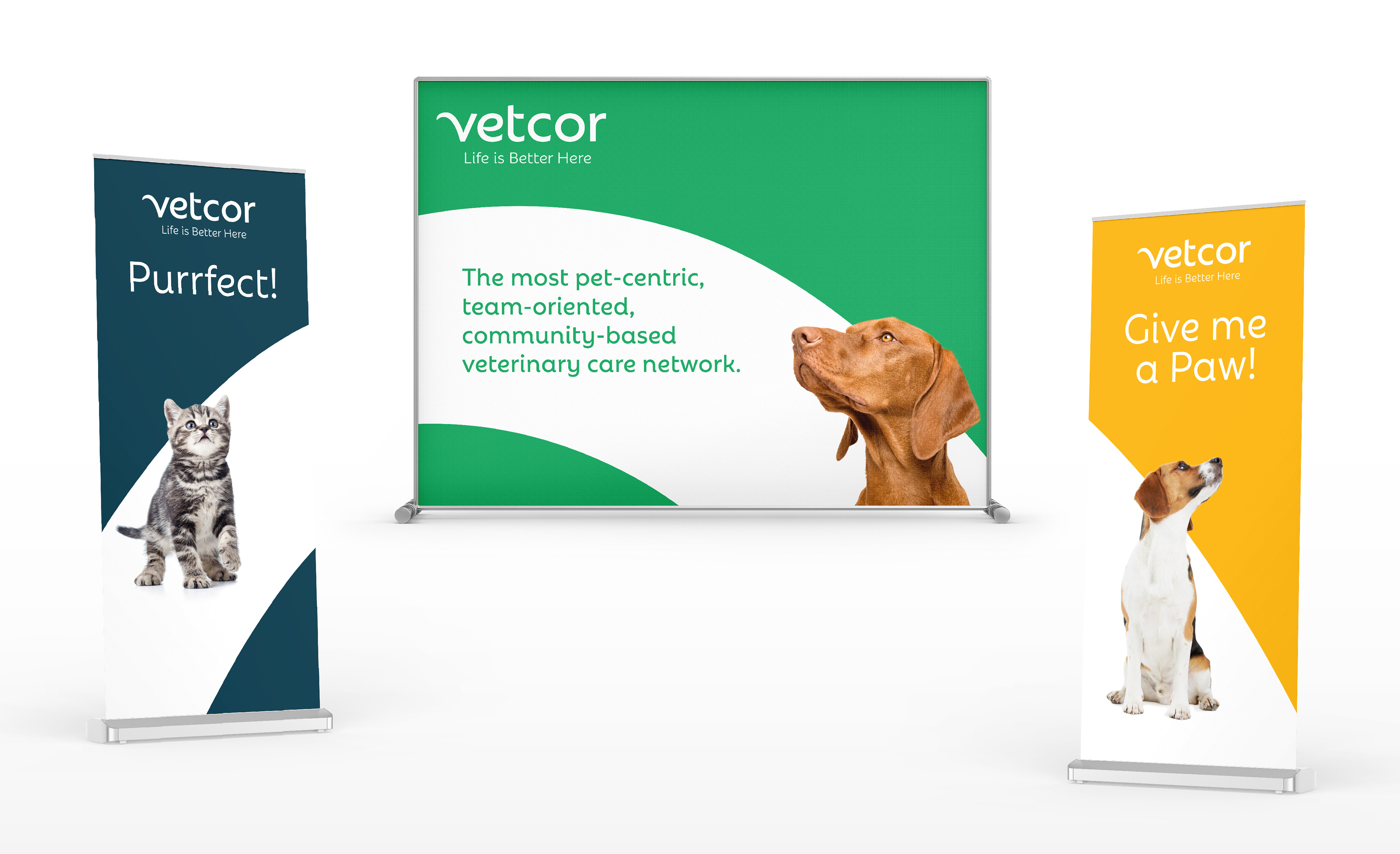
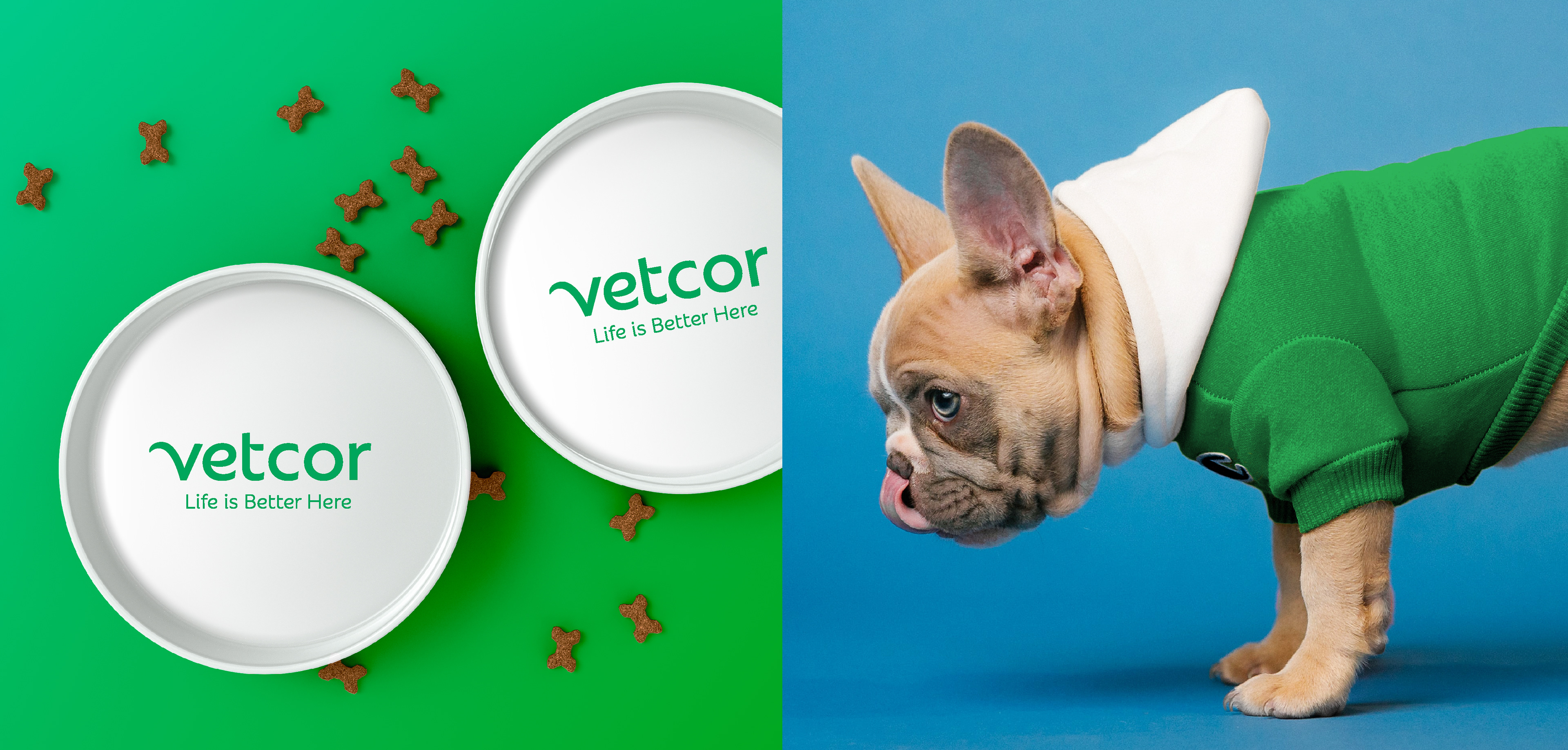
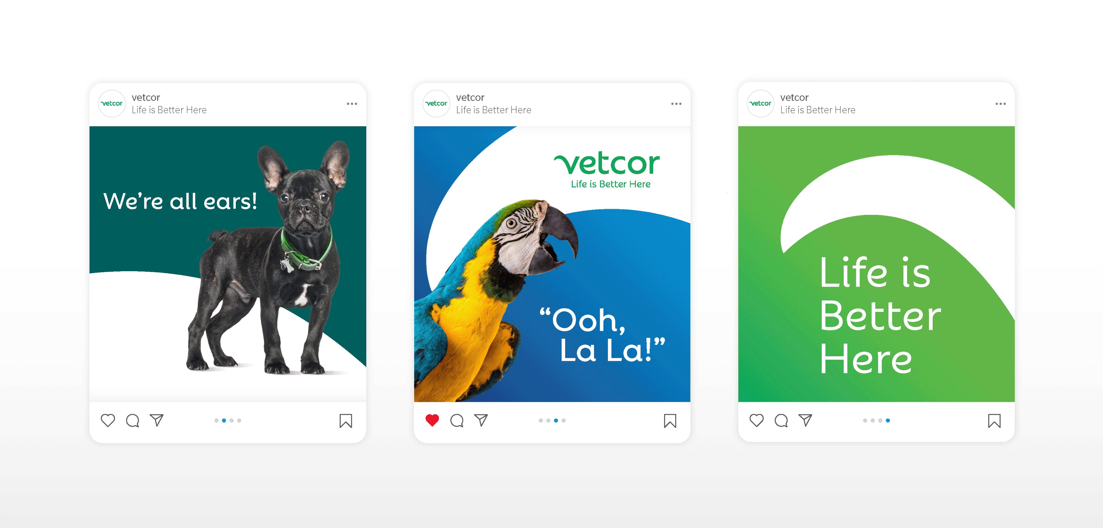
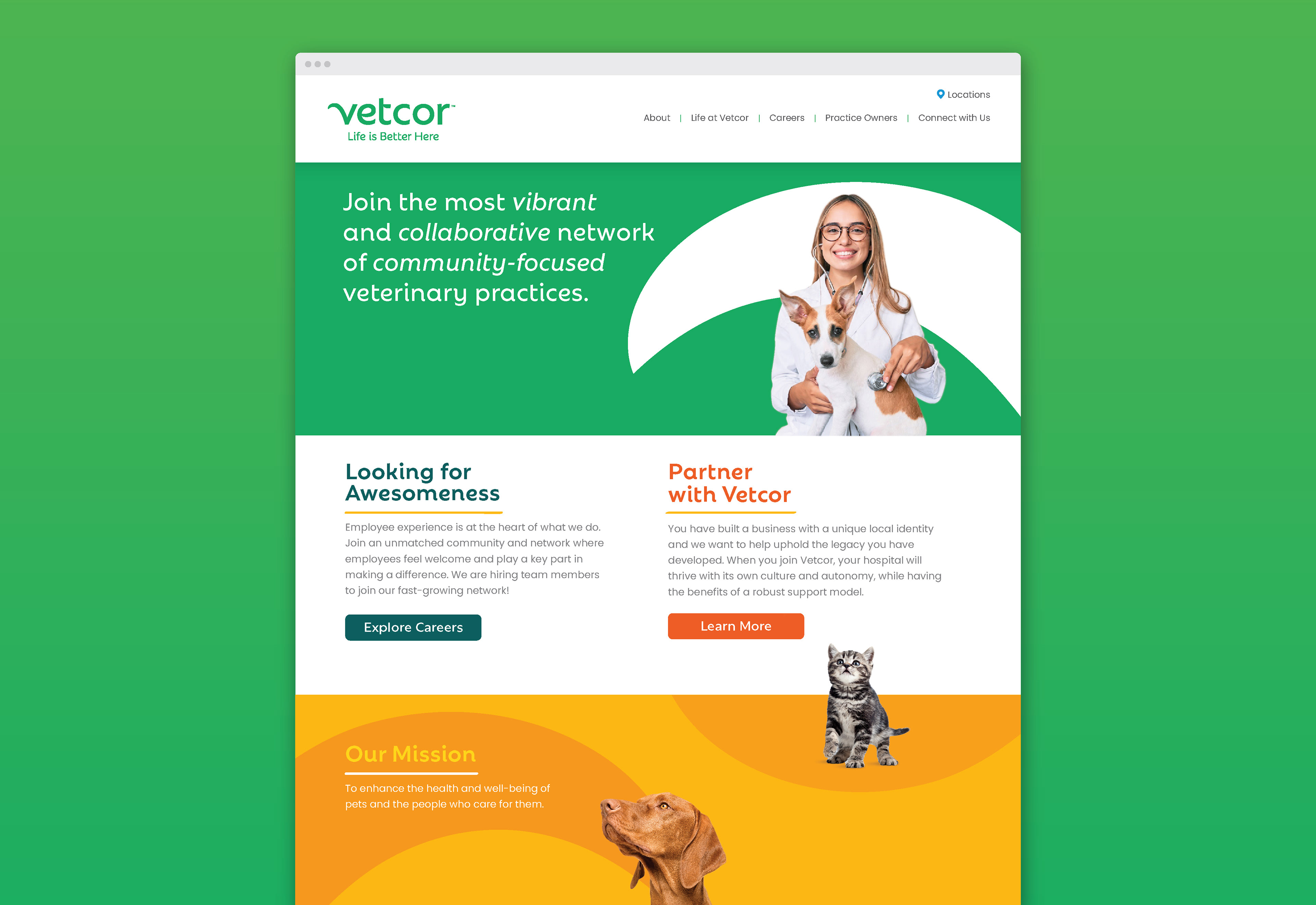
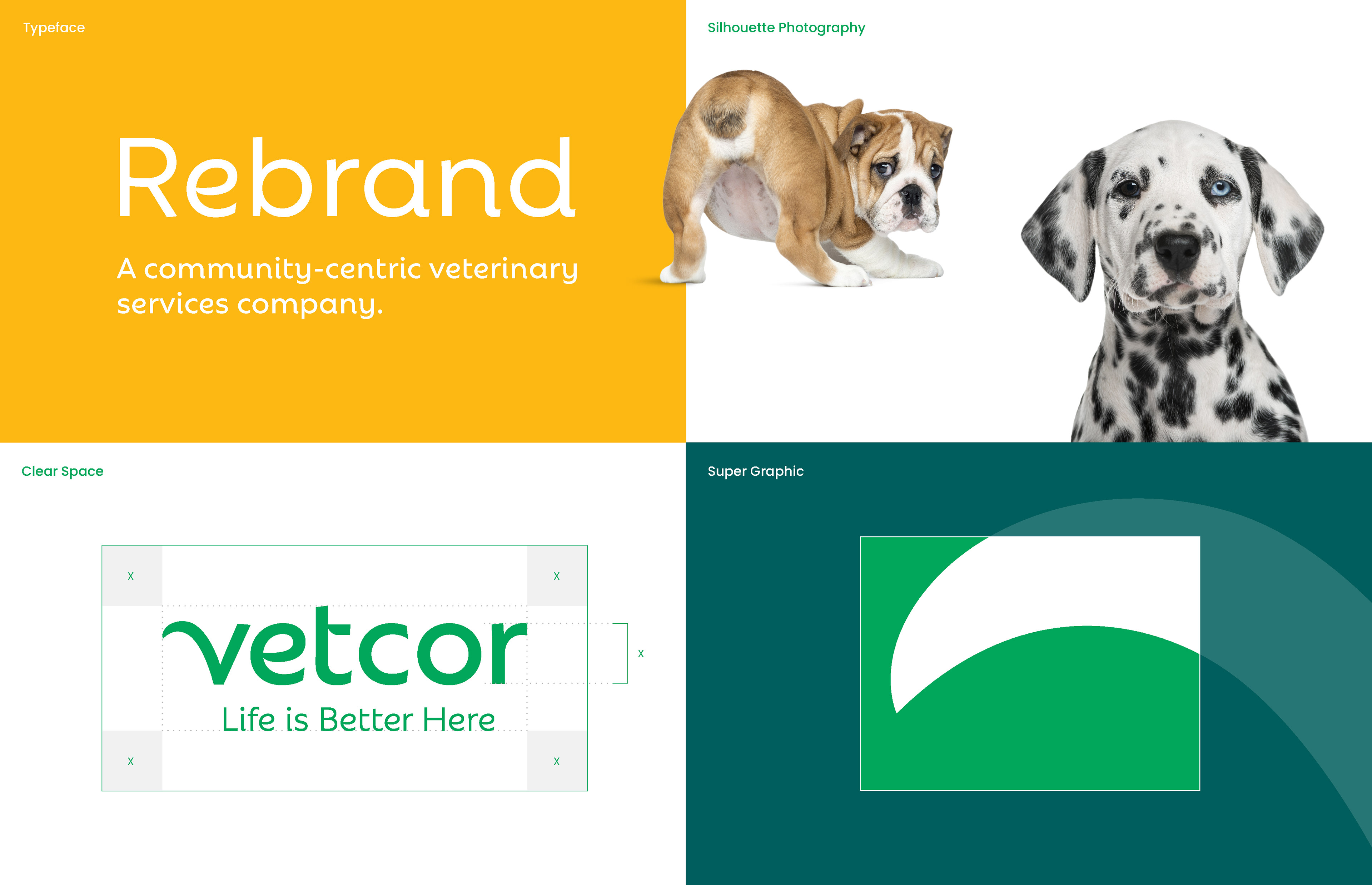
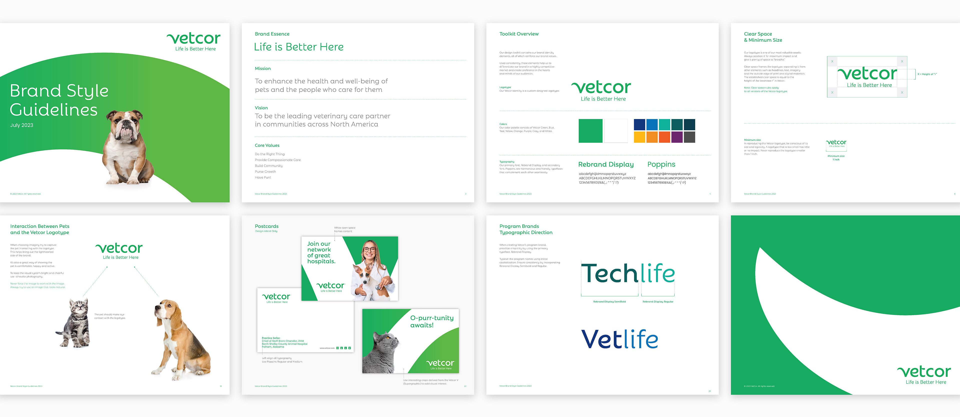
Inspired by the wag of a friendly tail, the lowercase wordmark creates a warm, approachable expression of pet companionship. The flourish in the “v” gives the identity a simple, memorable gesture, while the overall typography moves the brand away from anything corporate or institutional.
A bright green palette brings freshness and energy to the system, supported by secondary colors that evoke the everyday joy of pets, people, and community-based care.

The tail flourish extends beyond the wordmark as a flexible supergraphic, pairing with the secondary palette to create playful backgrounds with depth, movement, and warmth.
The result is a vibrant, pet-centric identity built to stand out in a crowded category while staying true to Vetcor’s simple and memorable message: “Life is Better Here.”
“This is a bold step in Vetcor’s journey – and will help us get recognized for our dedication to exceptional pet care, with a spirited touch resonating among the veterinary community and four-legged companions.”
Heather Bern
Chief Marketing Officer
Chief Marketing Officer
Contact us at info@pencilworx.com