PROJECT SUMMARY
AI-driven healthcare navigation
AI-driven healthcare navigation
SITUATION
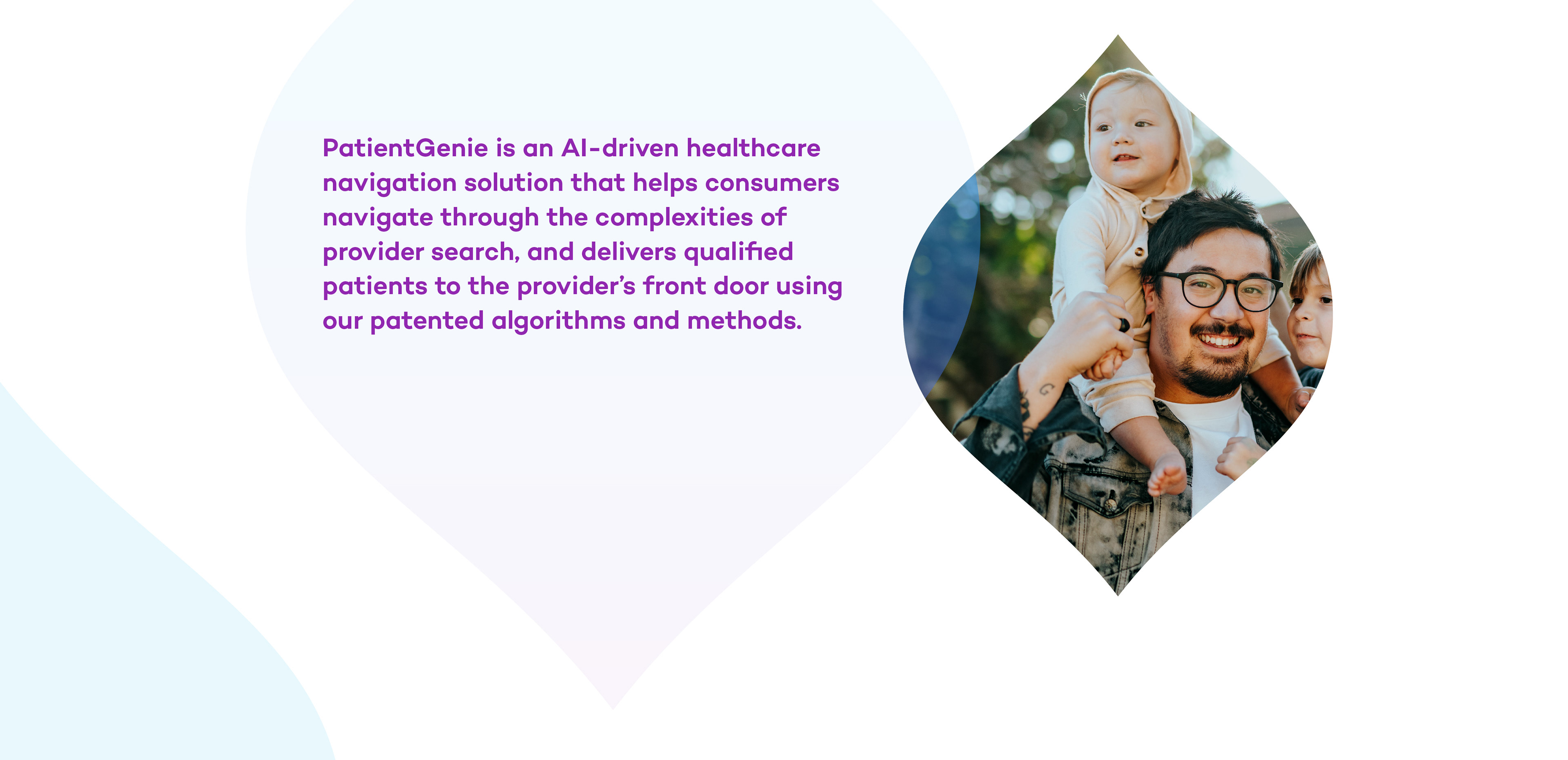
PatientGenie is a digital marketing management platform that helps connect healthcare consumers with the right providers.
PatientGenie is a digital marketing management platform that helps connect healthcare consumers with the right providers.
Built for a more connected healthcare landscape, the platform enables providers to engage people through browsers, social media, and secure messaging apps.
The identity needed to feel modern, approachable, and distinctly human, setting PatientGenie apart in a competitive digital healthcare market.
SOLUTION
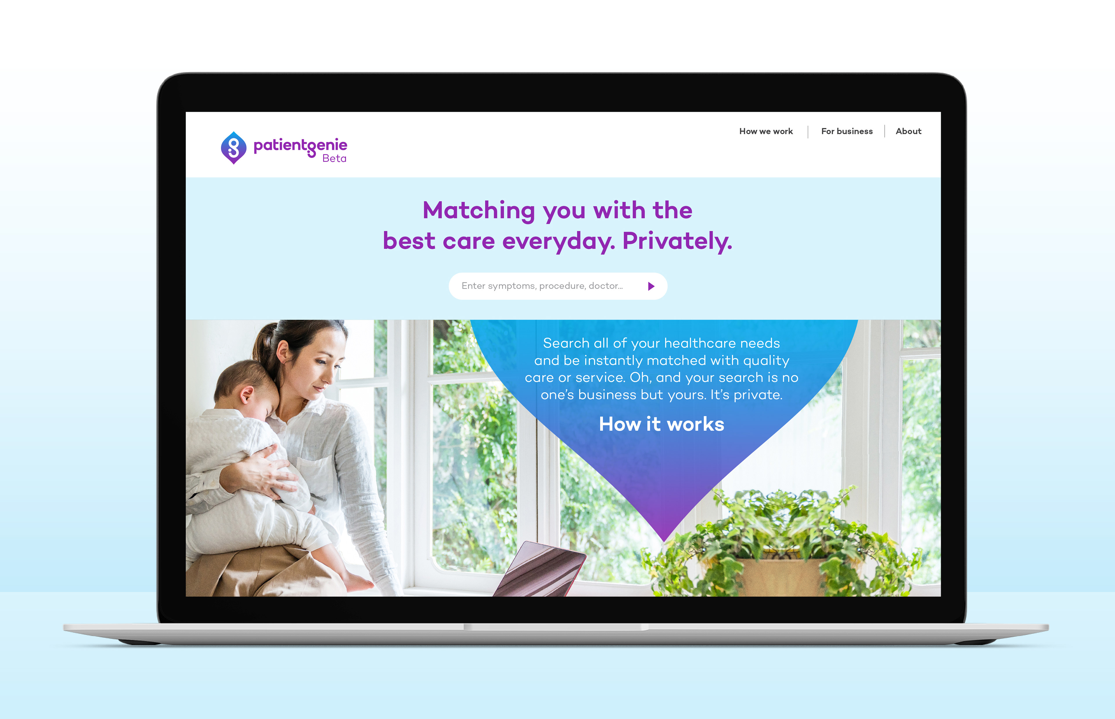
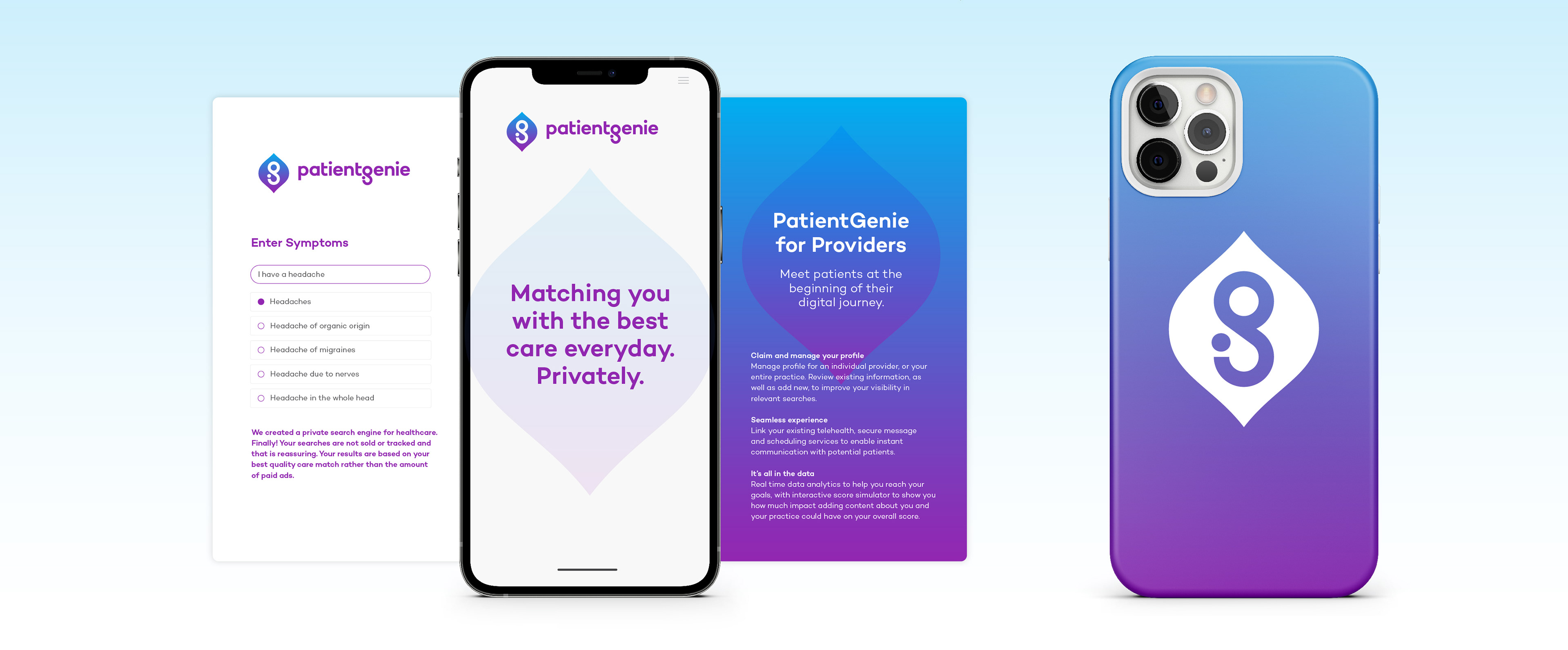
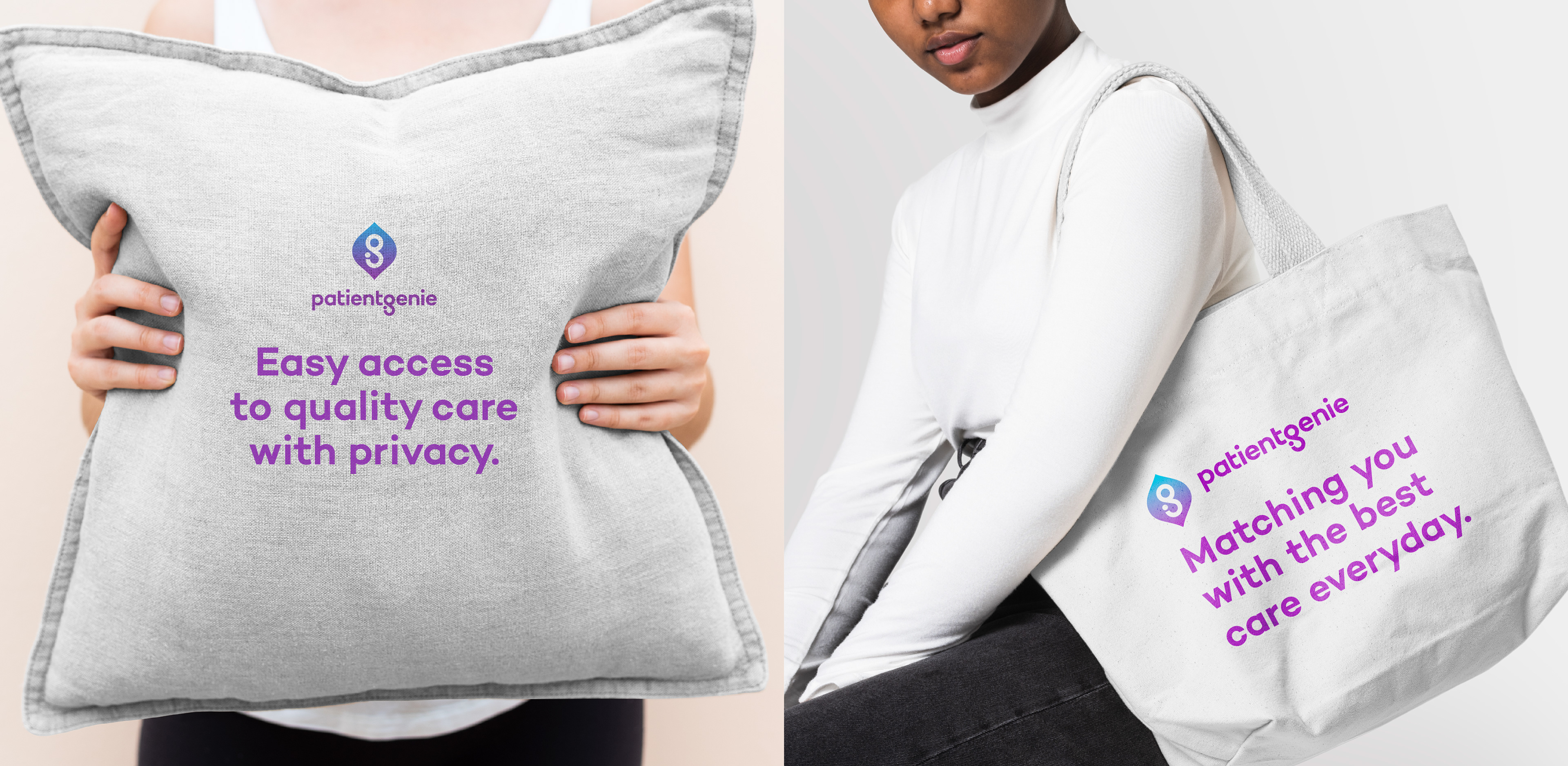
The identity moves beyond obvious healthcare cues while retaining the friendly, human quality suggested by the PatientGenie name.
The identity moves beyond obvious healthcare cues while retaining the friendly, human quality suggested by the PatientGenie name.
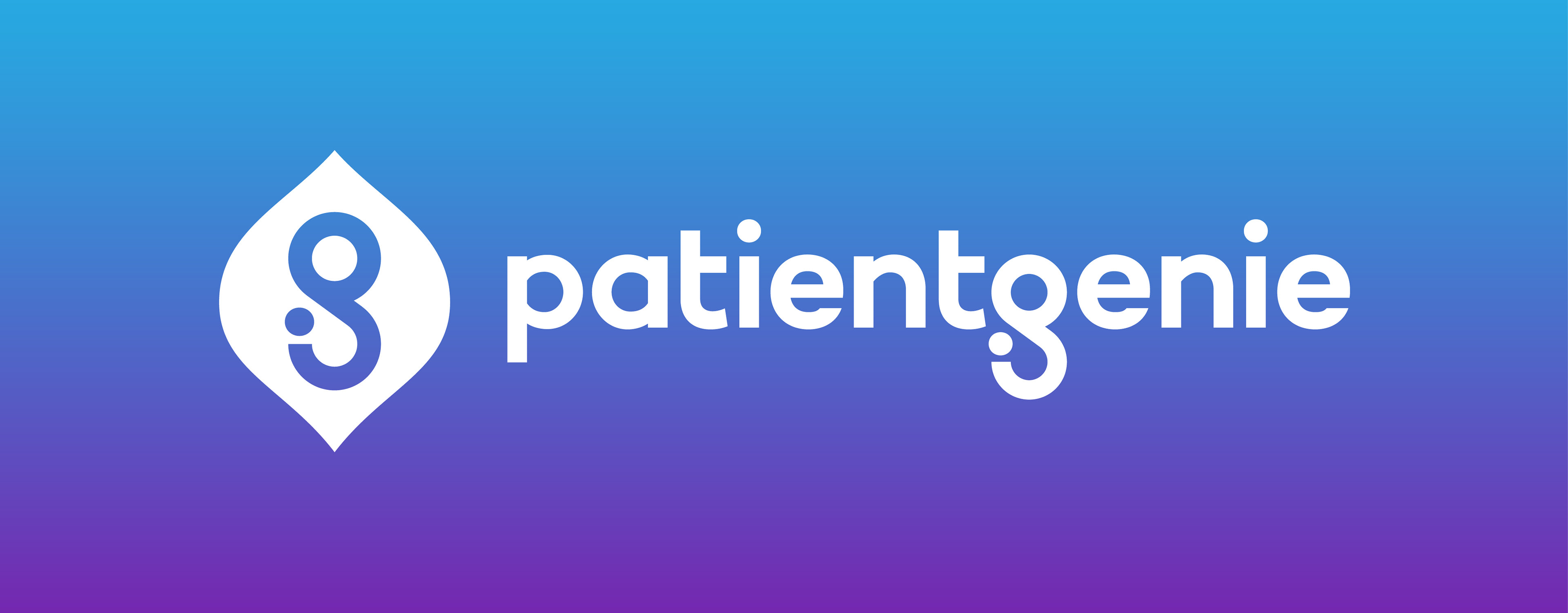
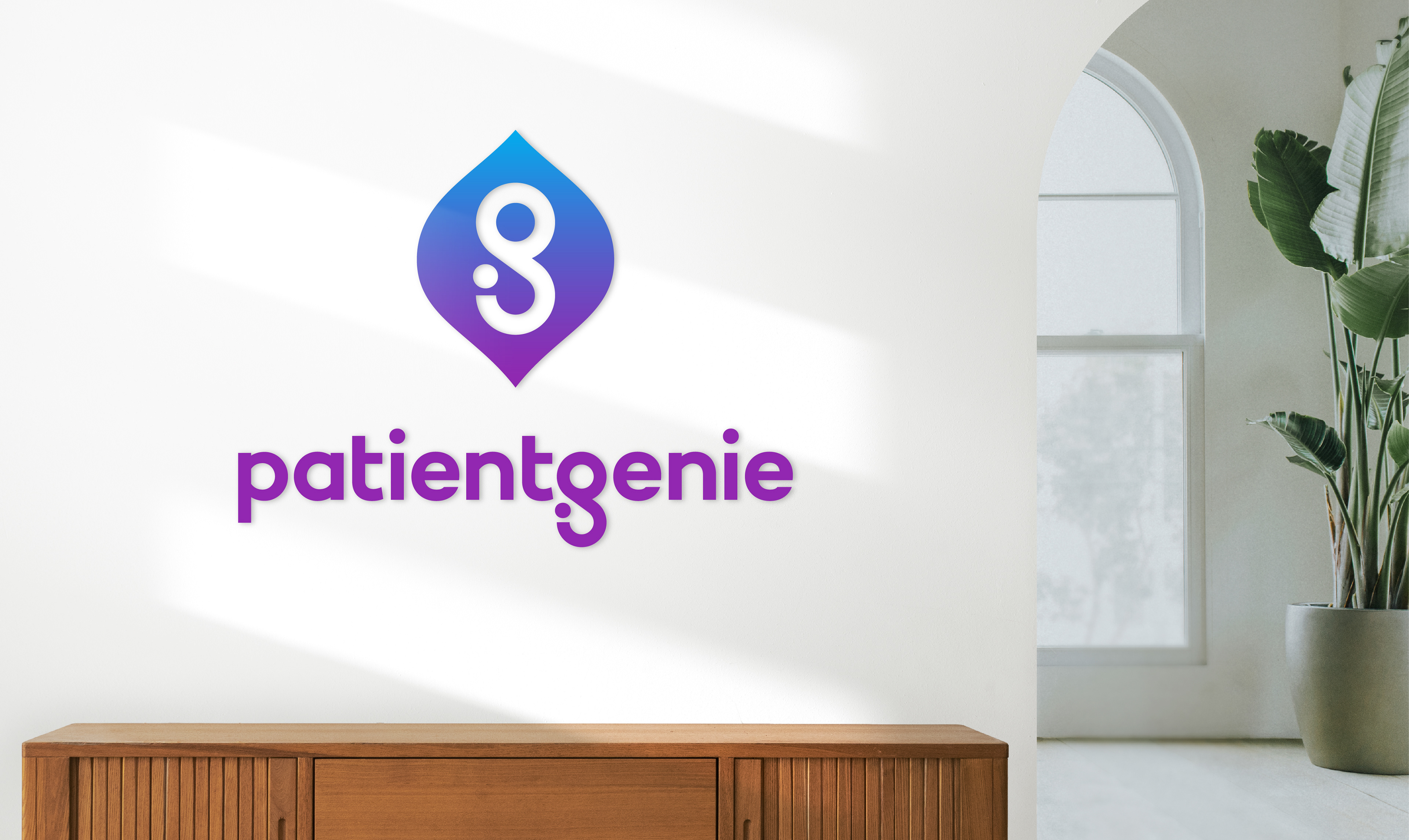
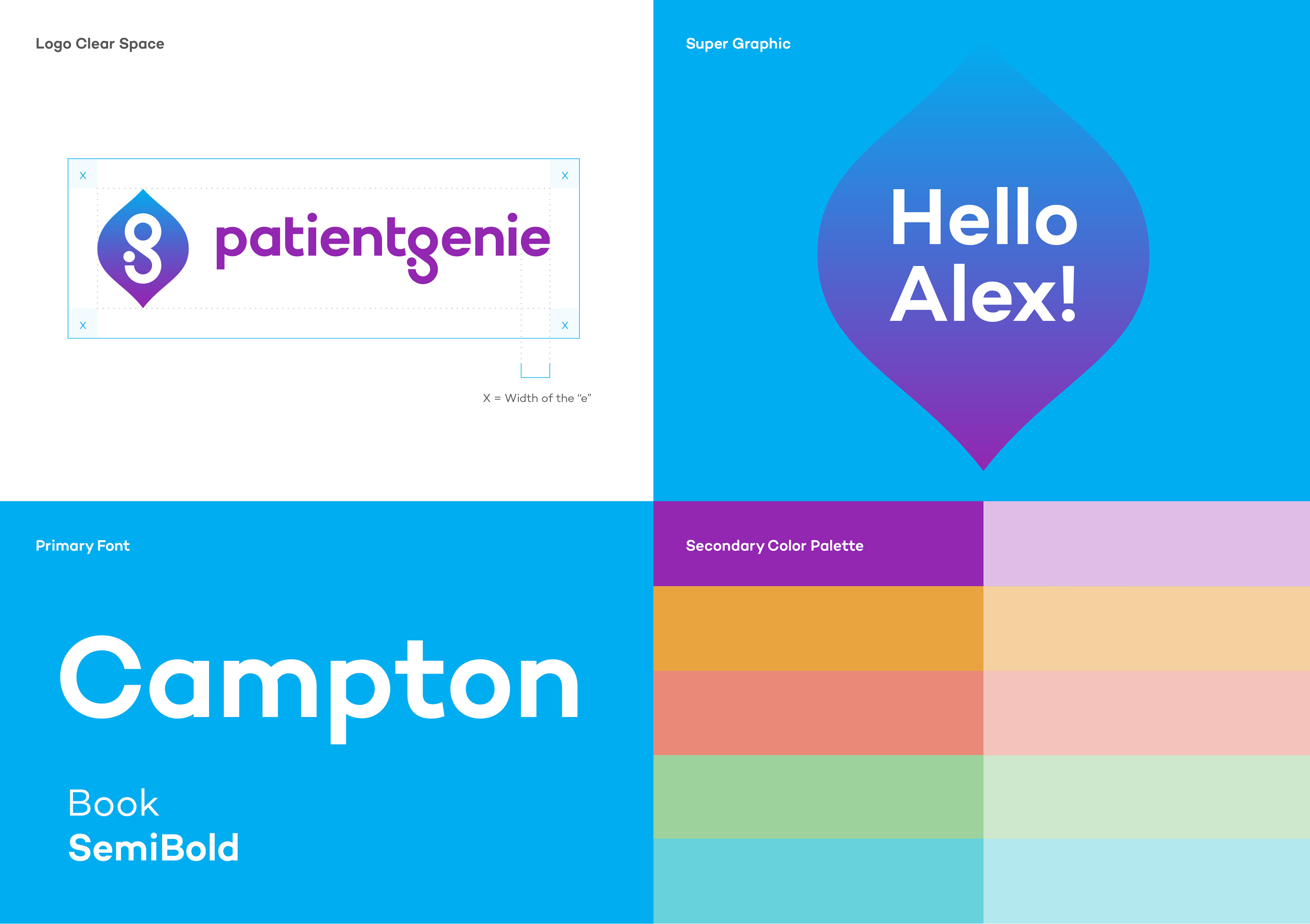
The icon reimagines the genie form as a distinctive speech bubble, connecting the idea of guidance with the conversations between providers and consumers at the center of the platform.
A bold, lowercase wordmark gives the brand a more approachable digital feel, while the royal purple palette creates separation in a category often dominated by expected healthcare colors.
The result is a distinctive, flexible identity built to feel modern, accessible, and memorable.
It was a privilege to work with Pencil Worx. The expertise, professionalism, and creativity blew us away.
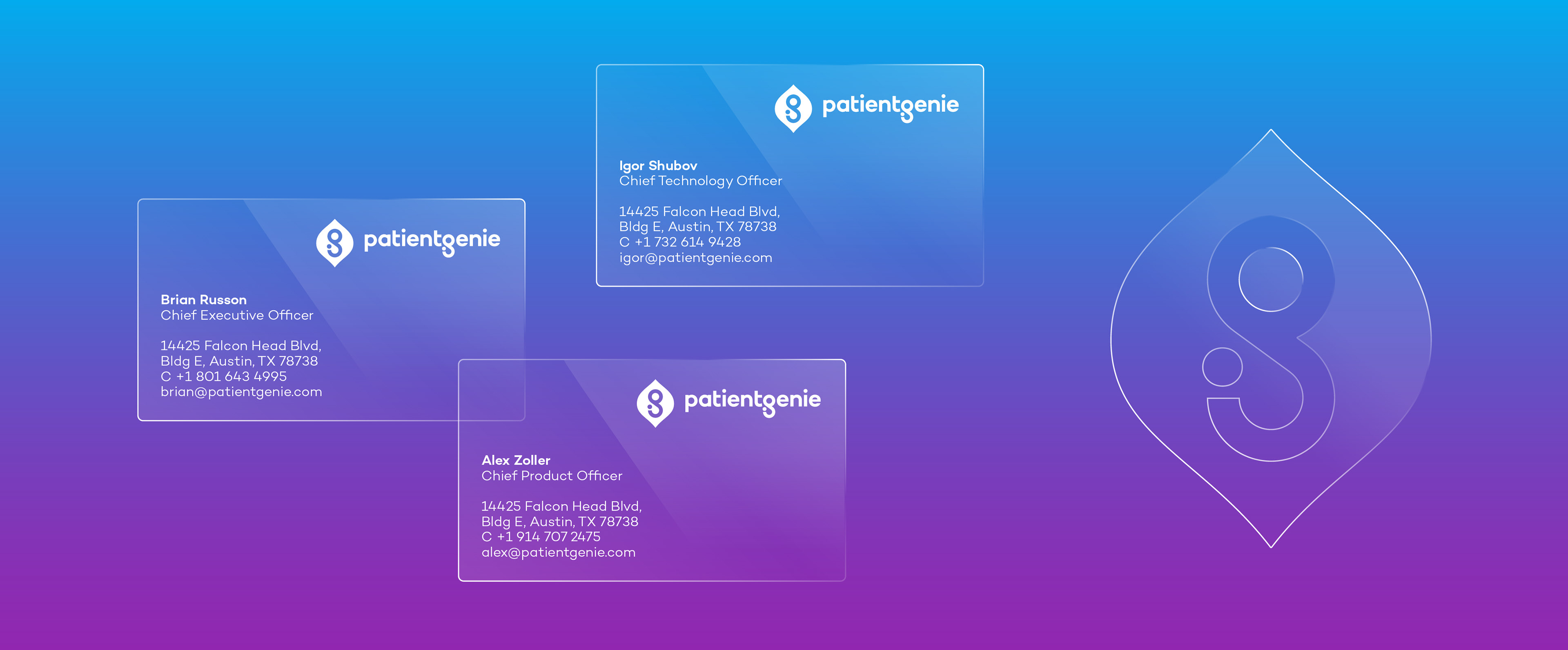
Alex Zoller
Chief Production Officer & Co-Founder, PatientGenie
Chief Production Officer & Co-Founder, PatientGenie
Contact us at info@pencilworx.com