PROJECT SUMMARY
The opioid crisis has to end.
The opioid crisis has to end.
JanOne was created to address one of the most urgent public health crises in America: the opioid epidemic.
Formerly Appliance Recycling Centers of America, the NASDAQ-listed company was undertaking a dramatic transformation, redirecting its leadership, resources, and entrepreneurial focus toward advocacy, technology, and pharmaceutical opportunities designed to help combat opioid addiction.
The challenge was to create an identity that could signal a bold new enterprise with the ambition, credibility, and urgency required for such a significant shift.
SOLUTION
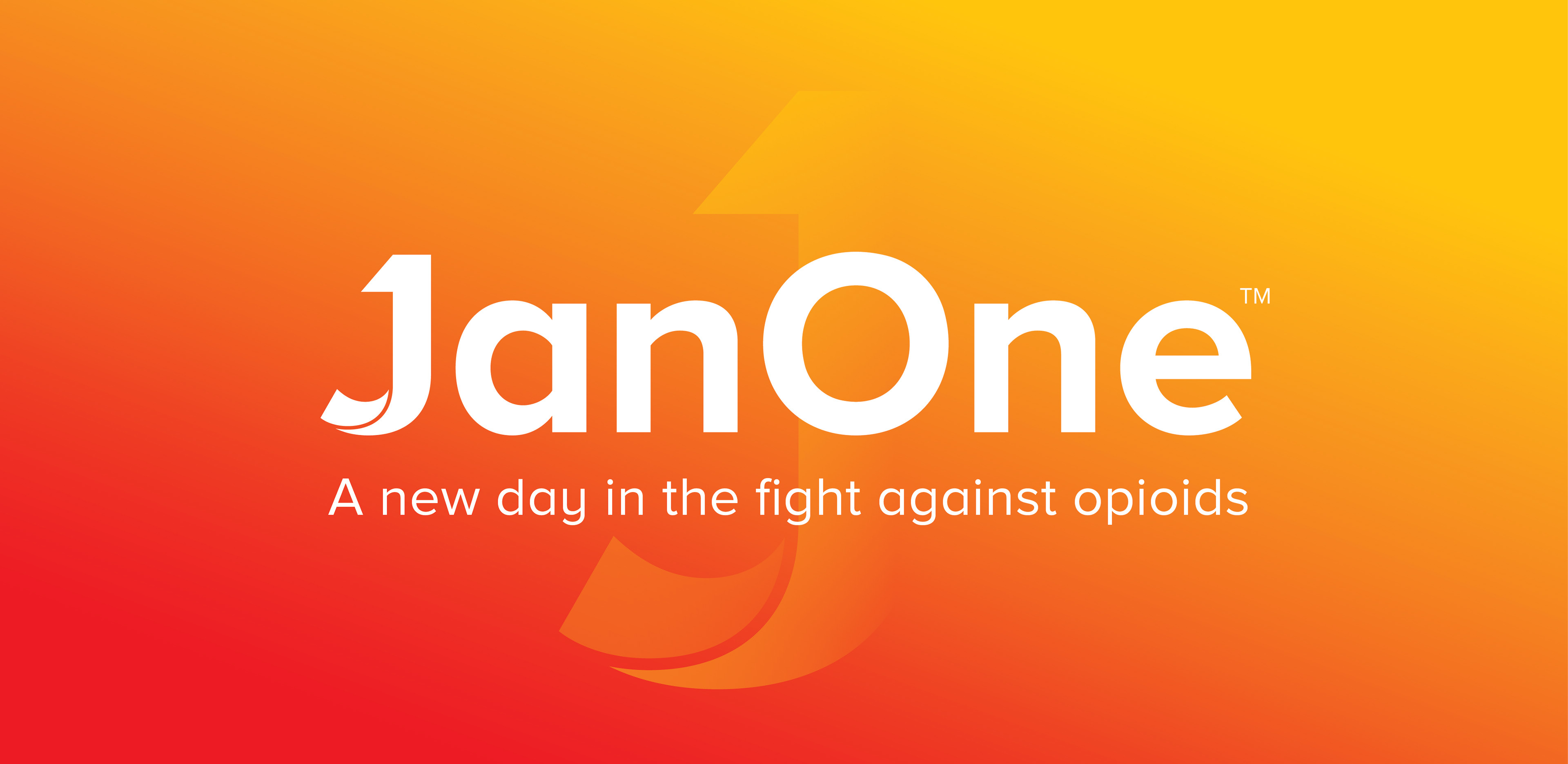
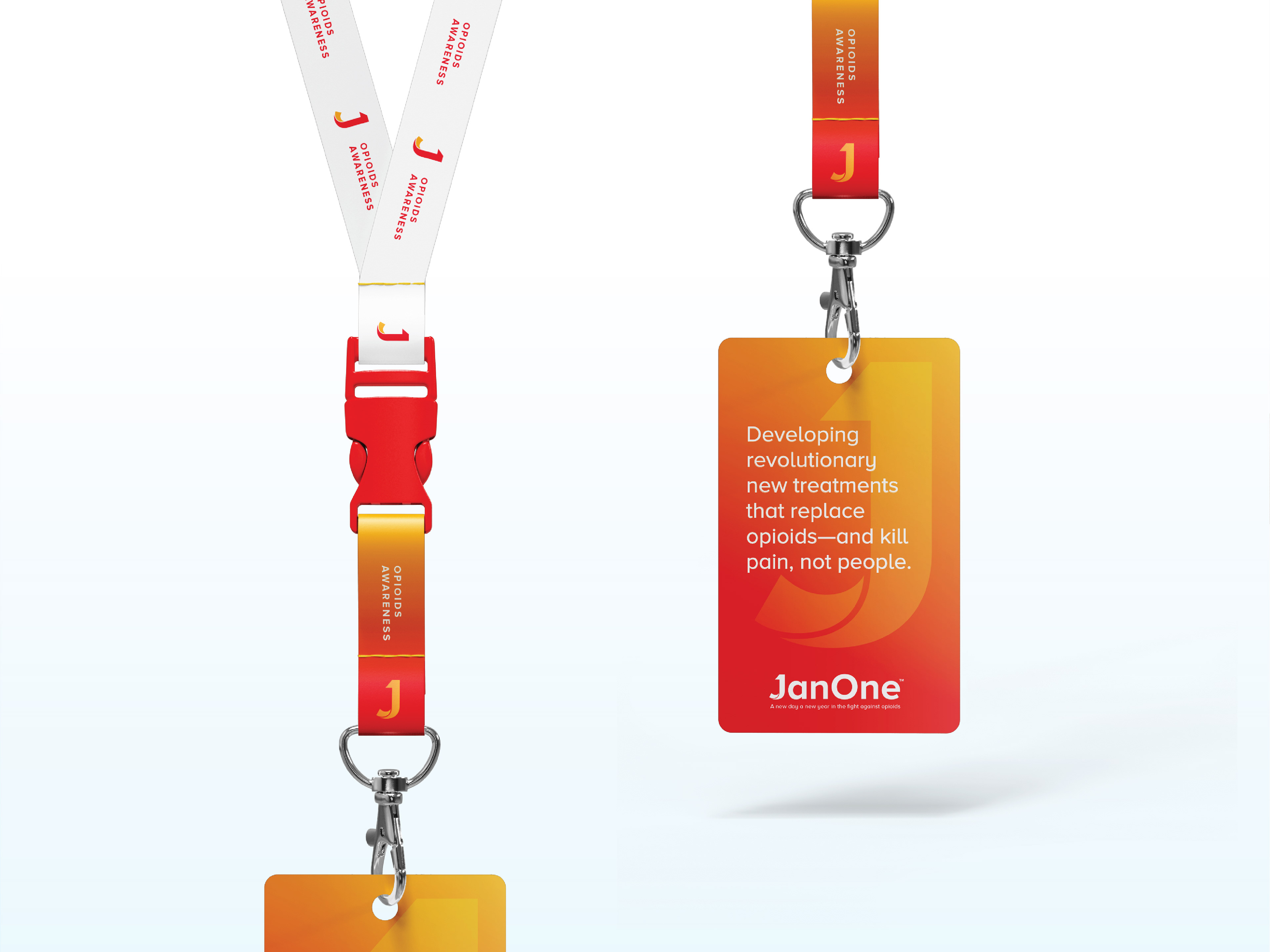
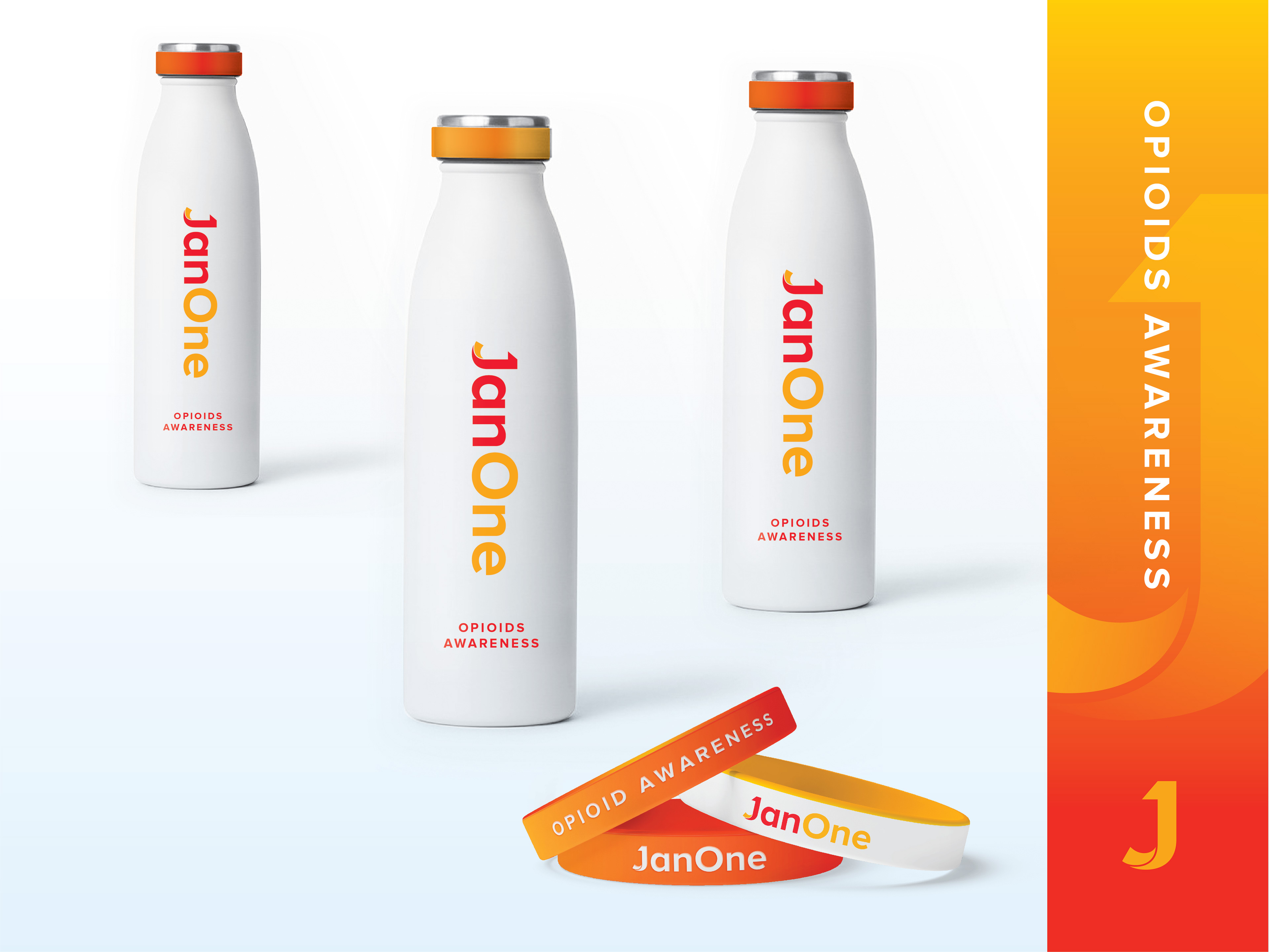
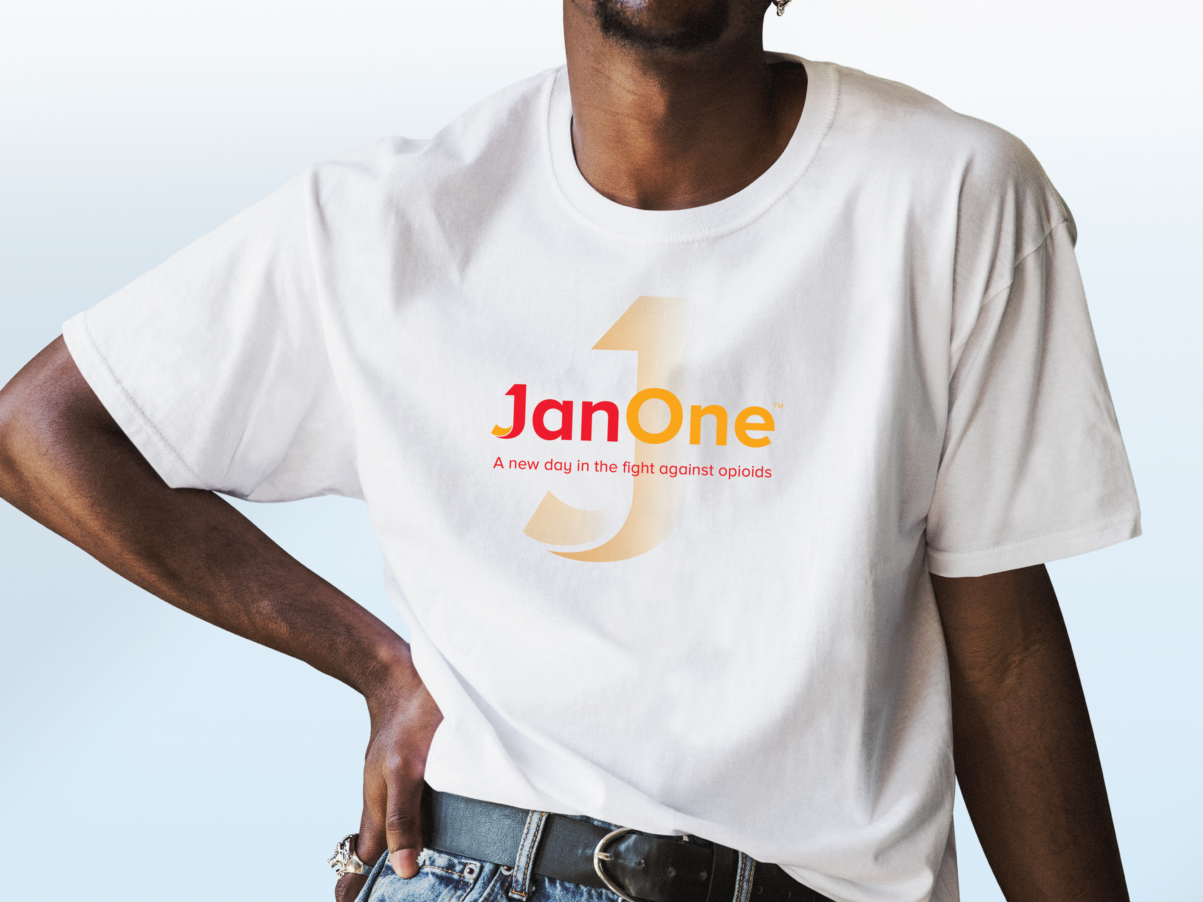
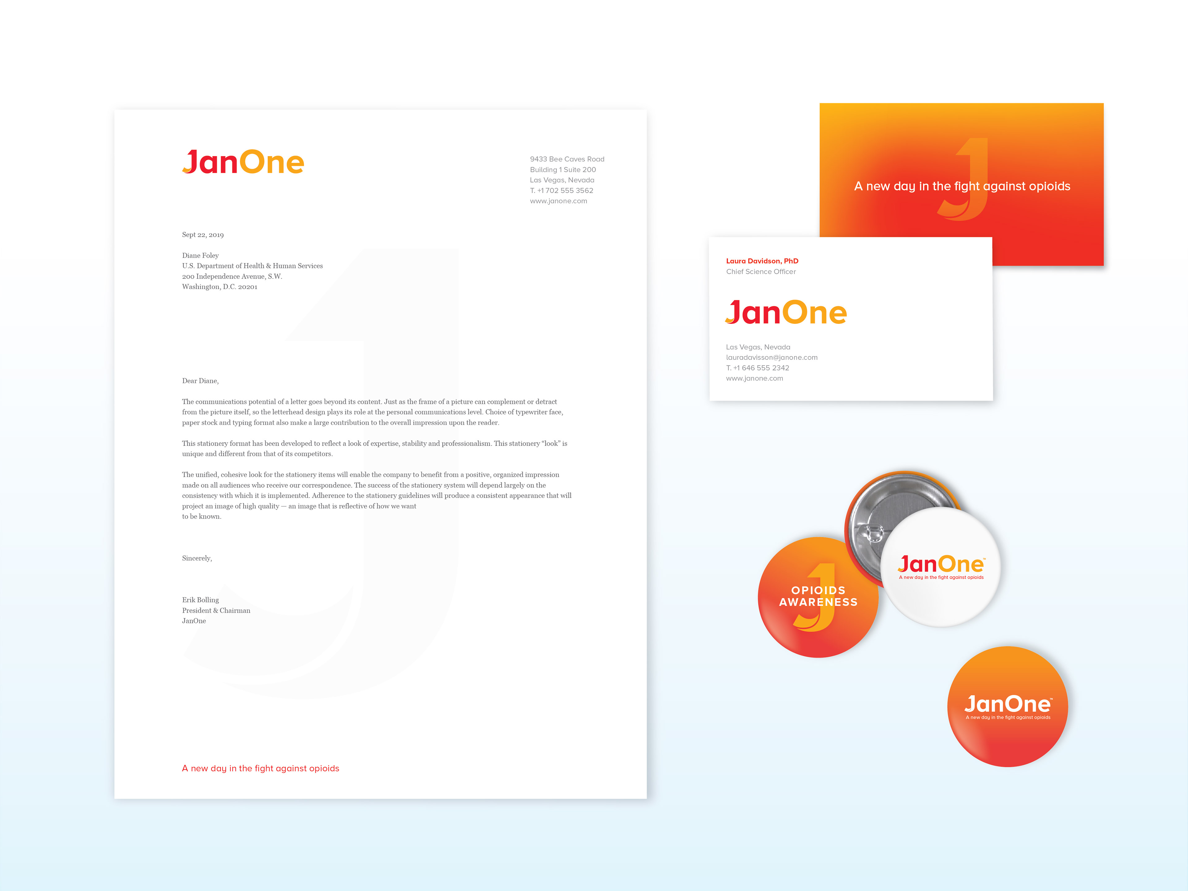
The JanOne name carries a clear metaphor: the first day of a new year, signaling resolve, optimism, and change.
The JanOne name carries a clear metaphor: the first day of a new year, signaling resolve, optimism, and change.
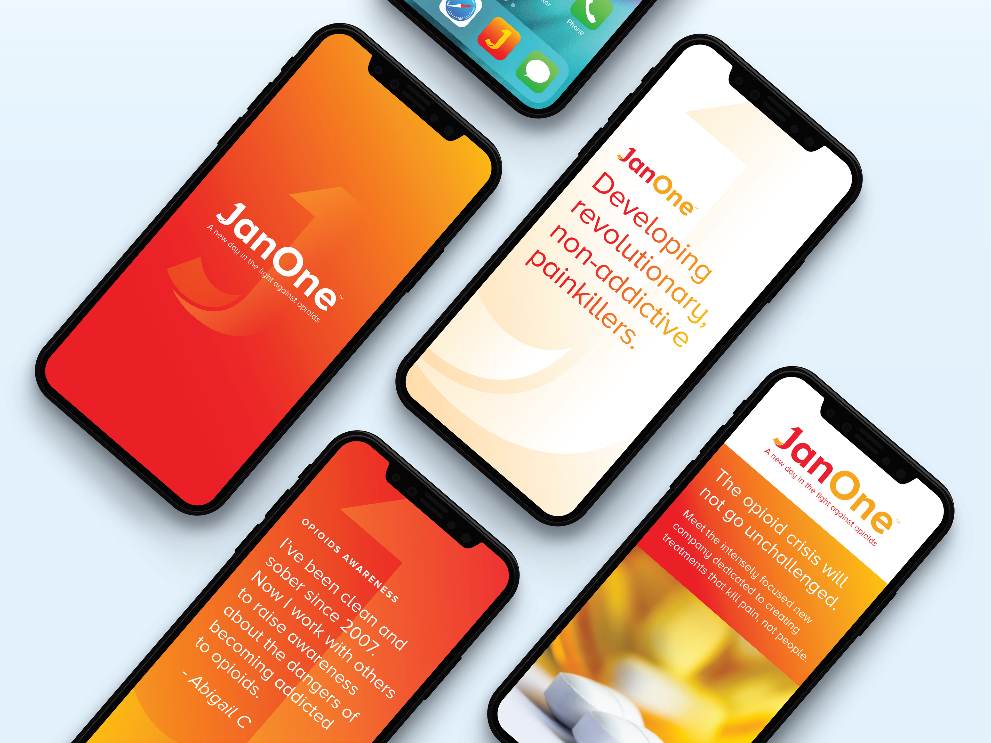
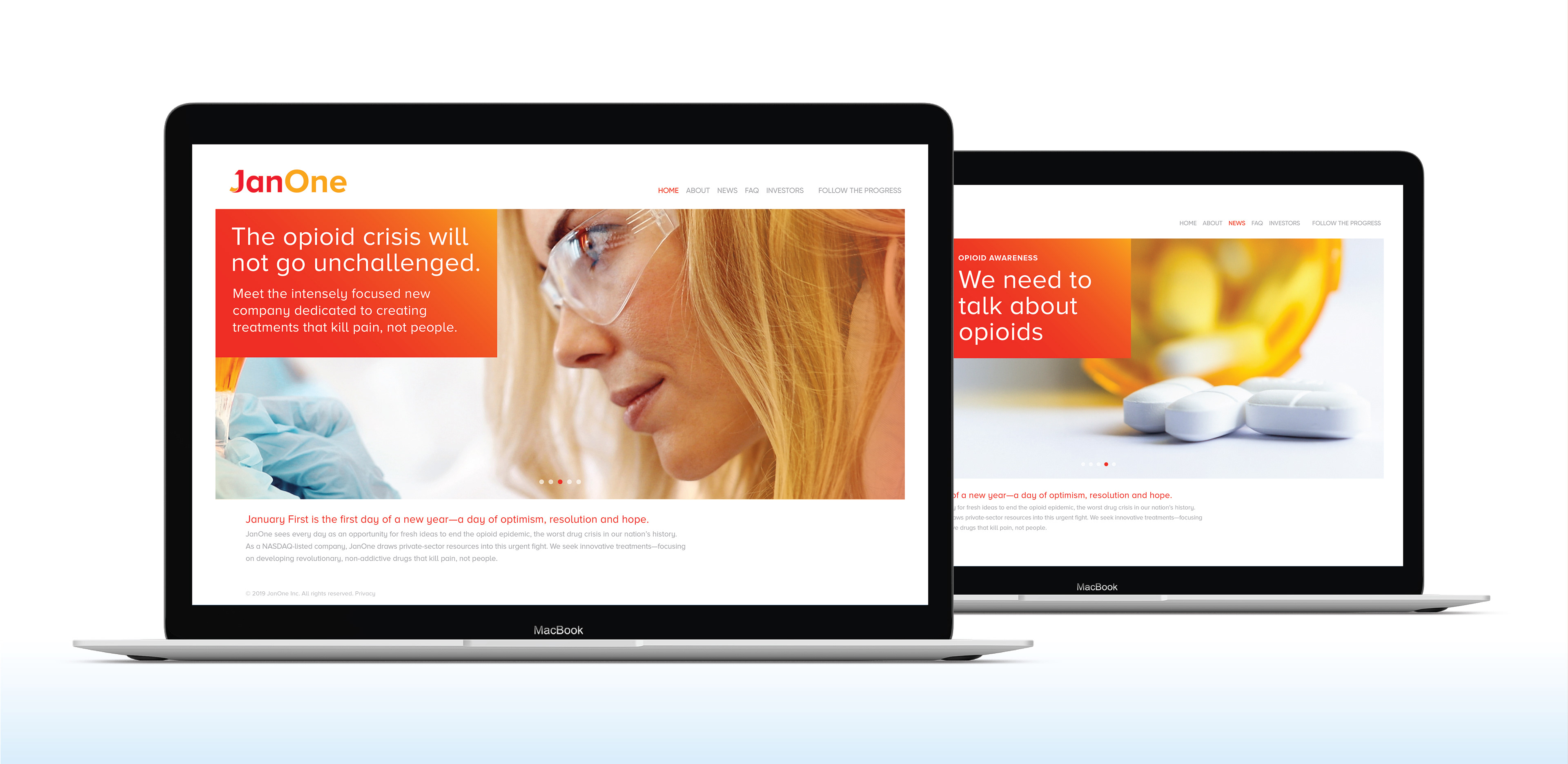
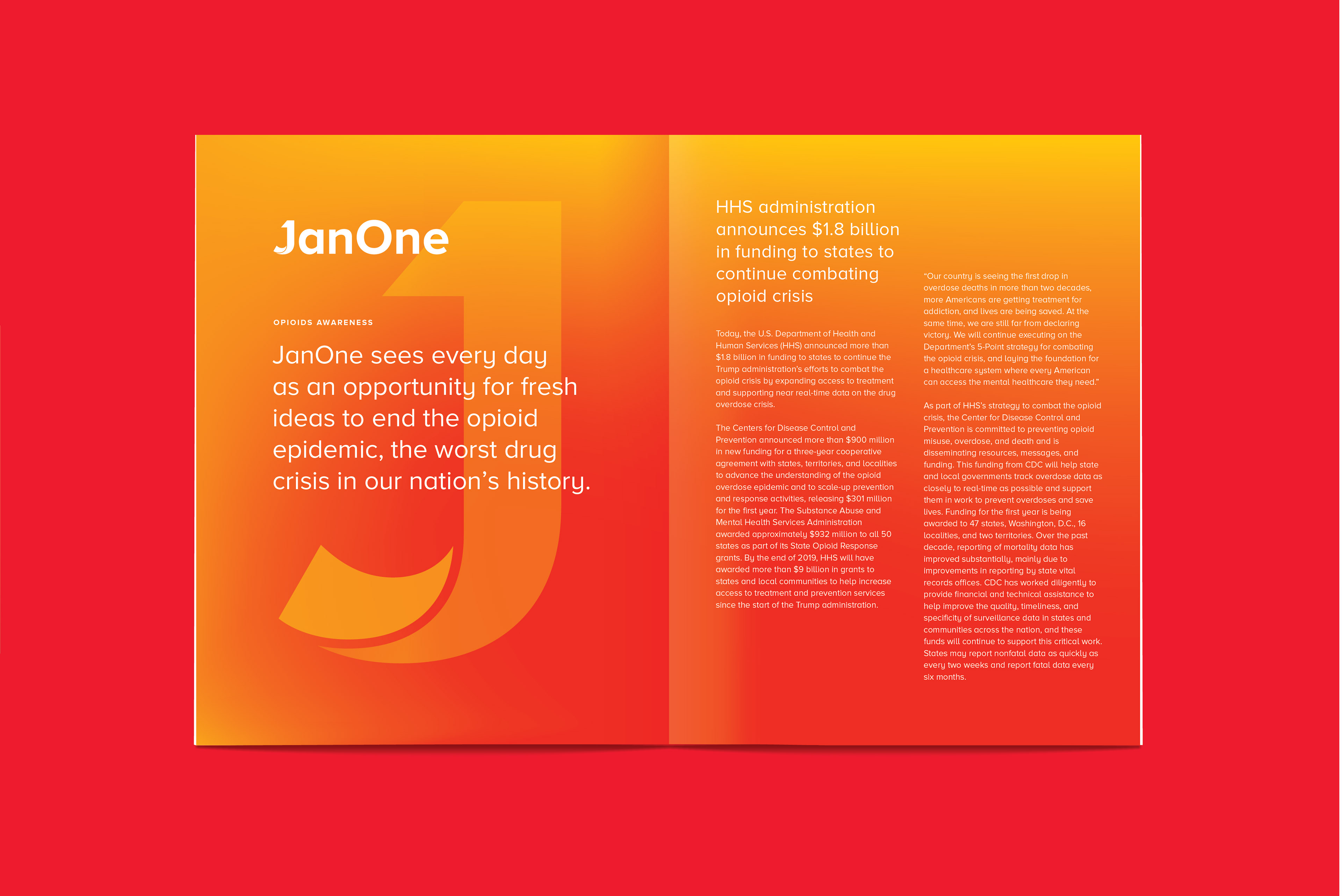
The identity was designed to let that meaning lead. A clean, direct logotype gives the brand clarity and confidence, while the orange and gold palette evokes the warmth and energy of dawn.
The combined “J” and “1” creates a distinctive standalone icon, giving JanOne a memorable asset that can scale across applications as the company evolves.
JanOne’s mission is to end opioid use in our lifetime—and to make sure that one day soon, society will be able to rely on effective drugs that kill only pain, not people.
Contact us at info@pencilworx.com