
PROJECT SUMMARY
Risk Management Reimagined.
Risk Management Reimagined.
SITUATION
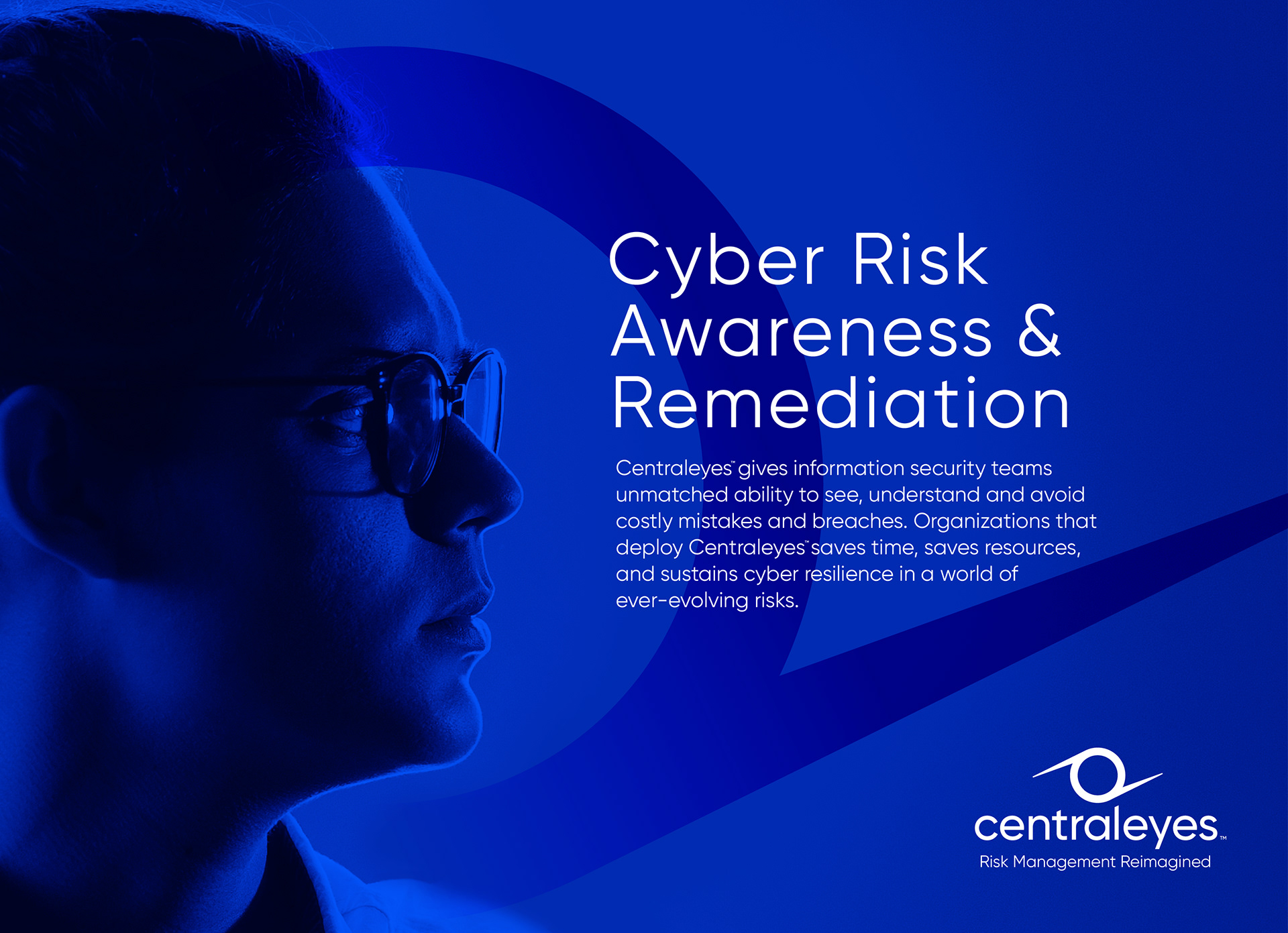
CyGov was preparing to launch Centraleyes, a flagship platform designed to redefine cyber risk management.
Built to gather live intelligence across multiple data sources, Centraleyes gives organizations a clear, measurable view of risk, helping them detect, assess, and strengthen their defenses in real time.
As CyGov repositioned for its next stage of growth, the brand needed to make a sharper statement: one that reflected the sophistication of the platform, the ambition of the business, and a new standard for the cybersecurity category.
SOLUTION
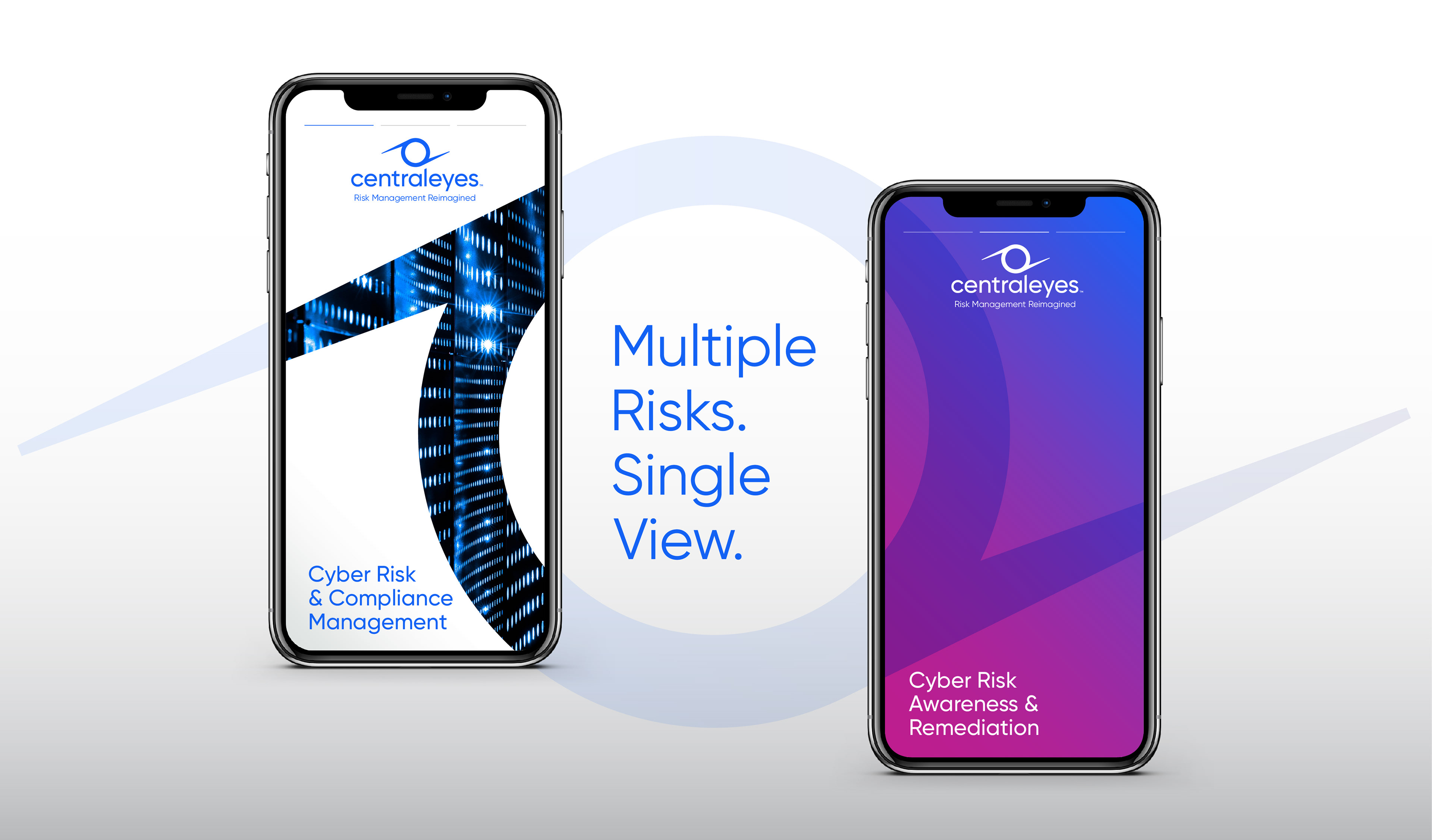
The first step was to move beyond the conventions of cybersecurity branding.
The first step was to move beyond the conventions of cybersecurity branding.
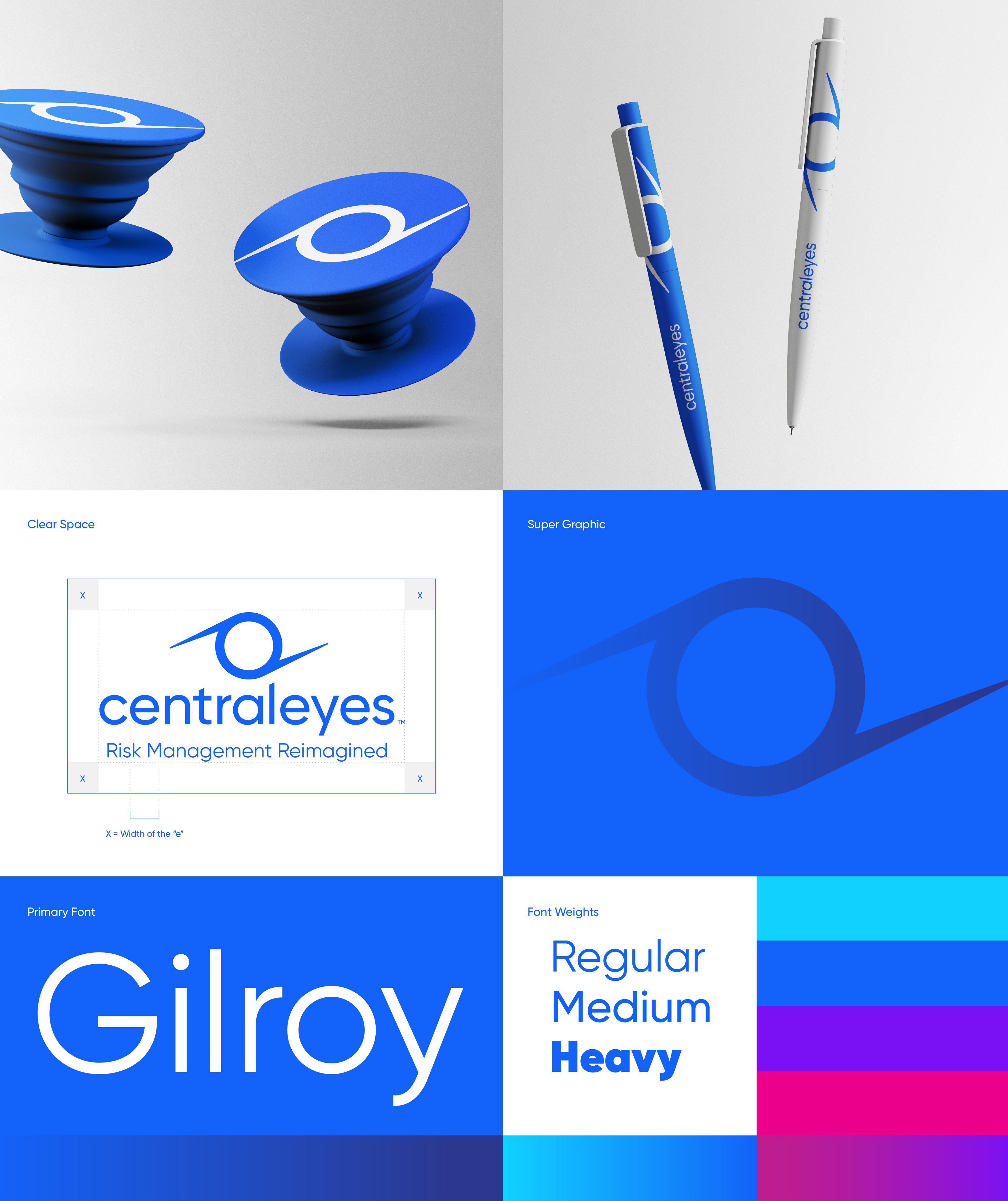
Rather than rely on militarized cues, locks, keys, or predictable security imagery, we created a precise geometric mark that reflects the intelligence and momentum within Centraleyes.
Built from a circle and tapered strokes, the symbol suggests focus, movement, and continuous vigilance. Centered above the wordmark, it creates a clear relationship with the lowercase “a” in Centraleyes, reinforcing a brand built around security, awareness, and constant oversight.

The typography uses a consistent line weight with subtle diagonal cuts that echo the angle of the symbol’s tapered strokes. This detail creates a stronger connection between mark and wordmark, giving the identity a more cohesive sense of motion and direction.
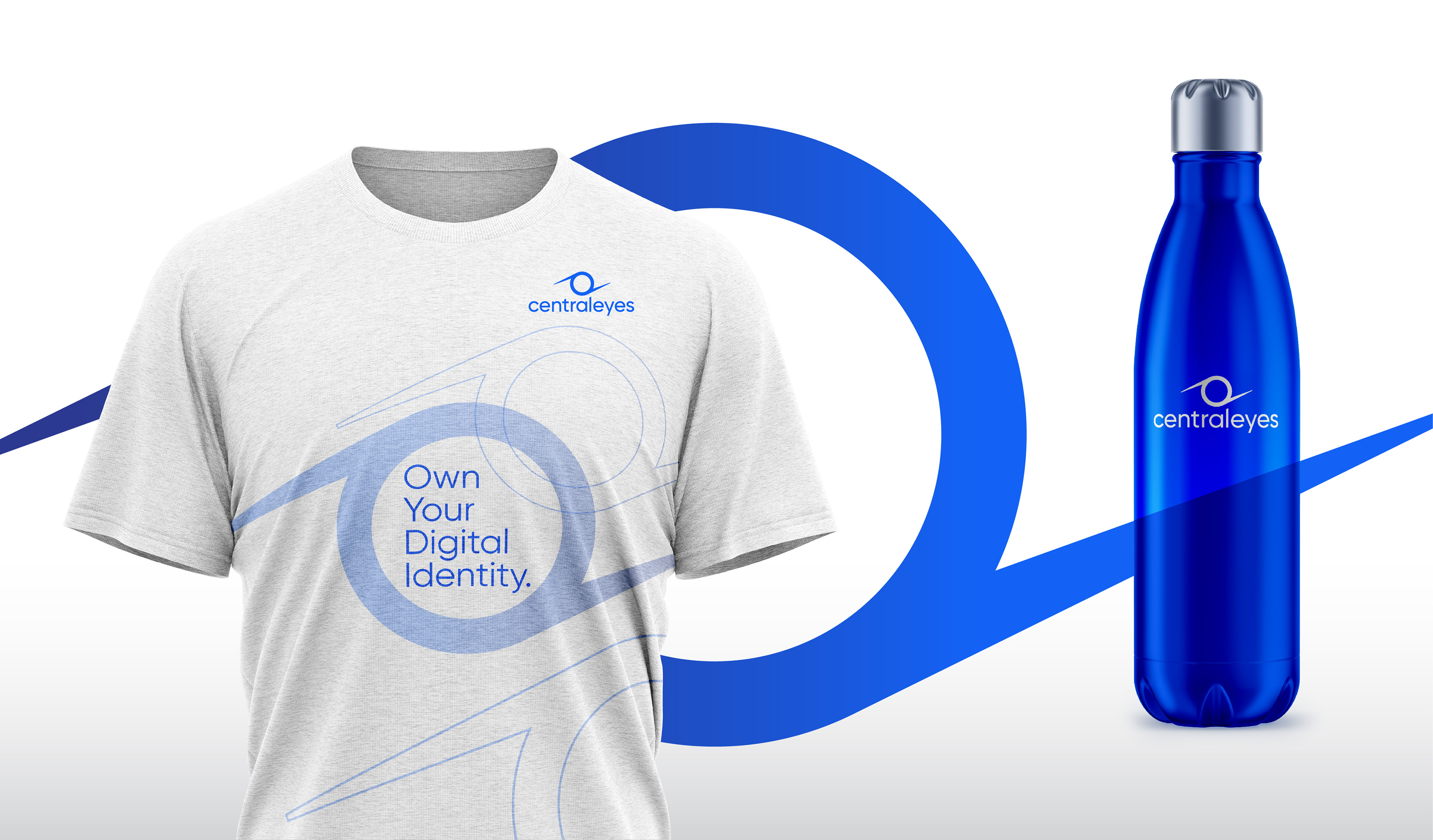
A fresher blue palette moves the brand into a more contemporary technology space while maintaining a clear relationship to the parent company’s magenta and dark blue.
Together, the system creates a distinctive, future-facing identity for a cyber technology platform built around clarity, vigilance, and continuous intelligence.

“Partnering with Pencil Worx was an exceptional experience. They led us through a rigorous process that clarified our brand and translated it into a visual identity capable of expressing who we are in a single mark.
The quality of the work was on par with the brand standards I knew from leading Visa across global markets.”
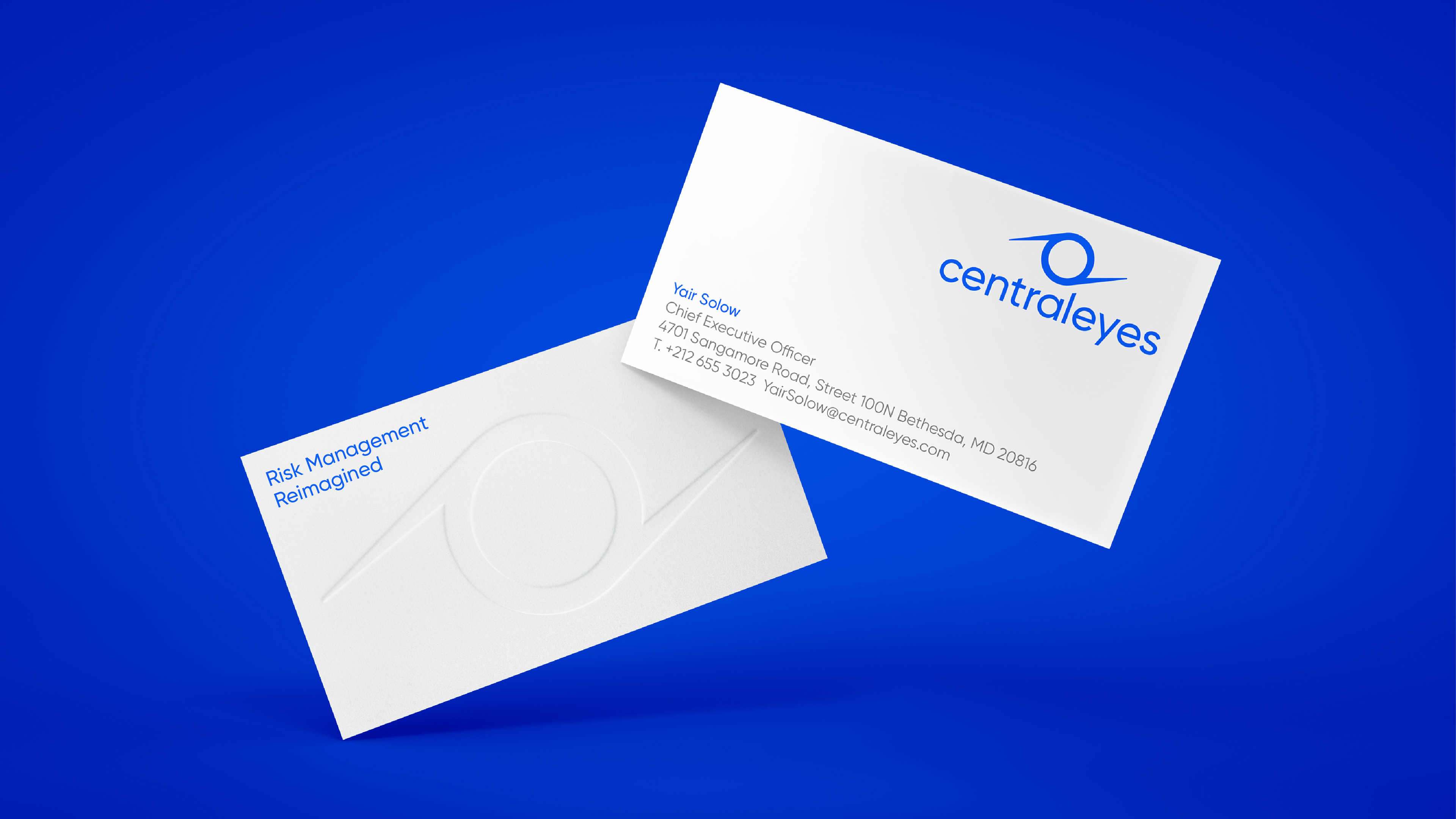
Yair Solow
CEO & Co-Founder
CEO & Co-Founder
Contact us at info@pencilworx.com