PROJECT SUMMARY
The Perfect Pickle
The Perfect Pickle
SITUATION
As probiotics moved into the mainstream, this Austin-based fermented vegetable brand was gaining strong traction at Whole Foods.
As probiotics moved into the mainstream, this Austin-based fermented vegetable brand was gaining strong traction at Whole Foods.
With national expansion ahead, the brand needed to stand out in a crowded category, balancing natural, wholesome credibility with a bolder sense of energy and appetite appeal.
SOLUTION
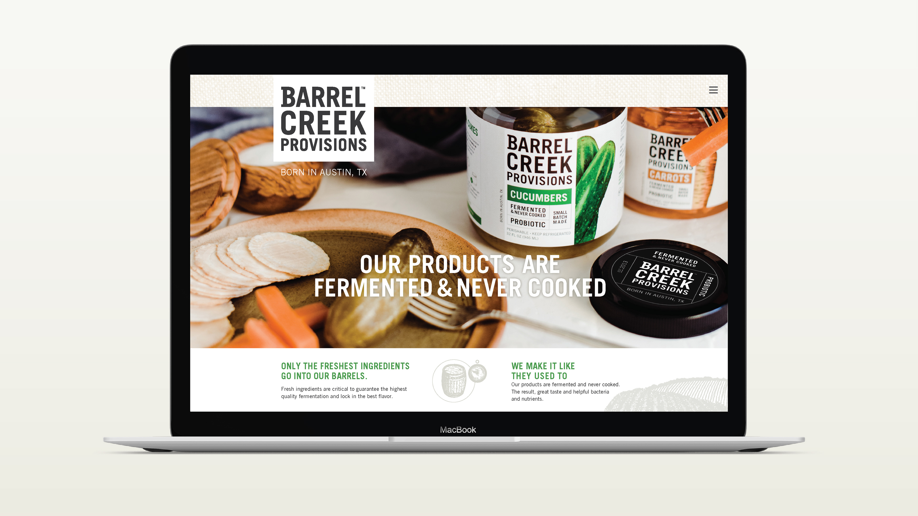
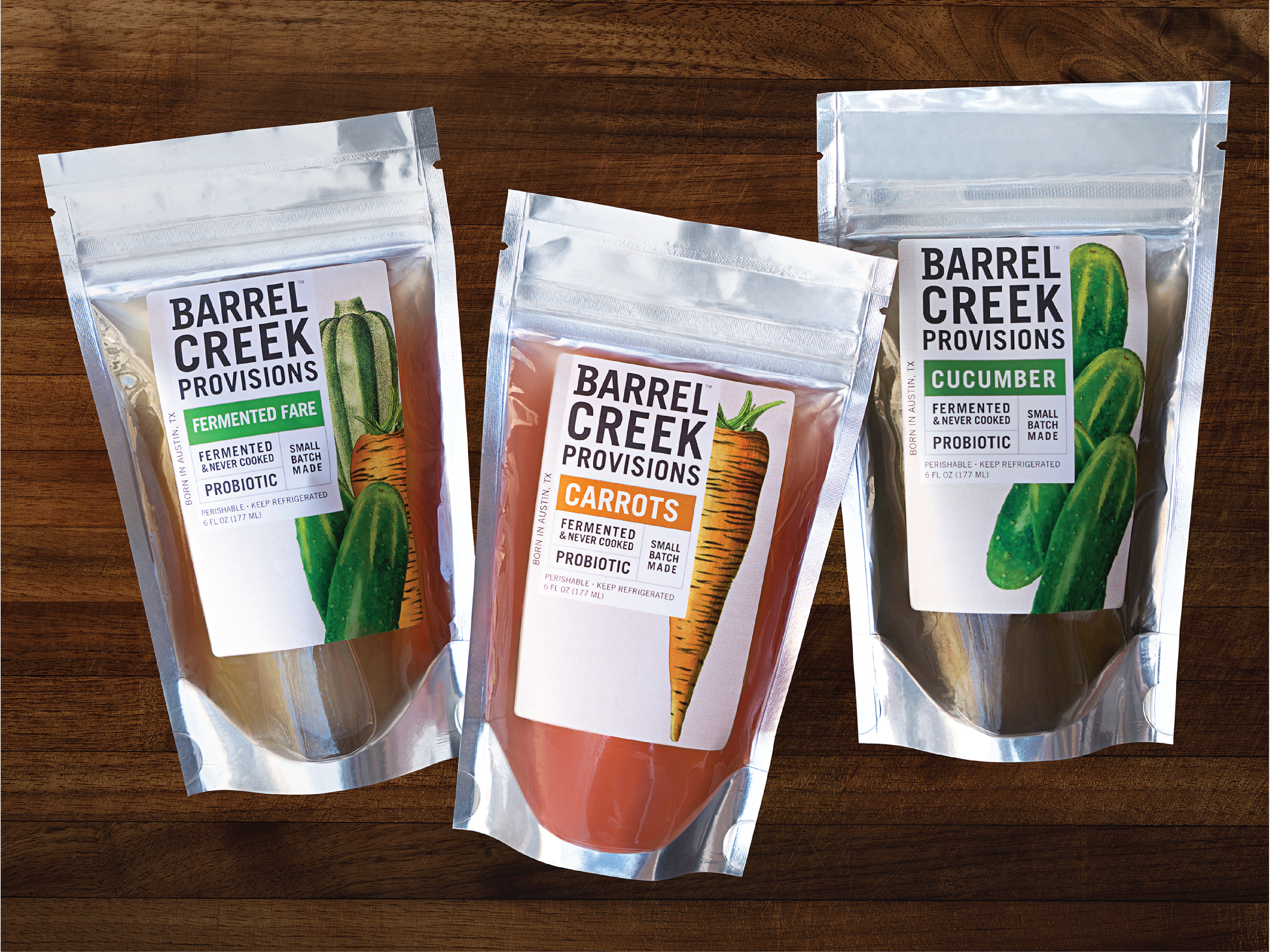
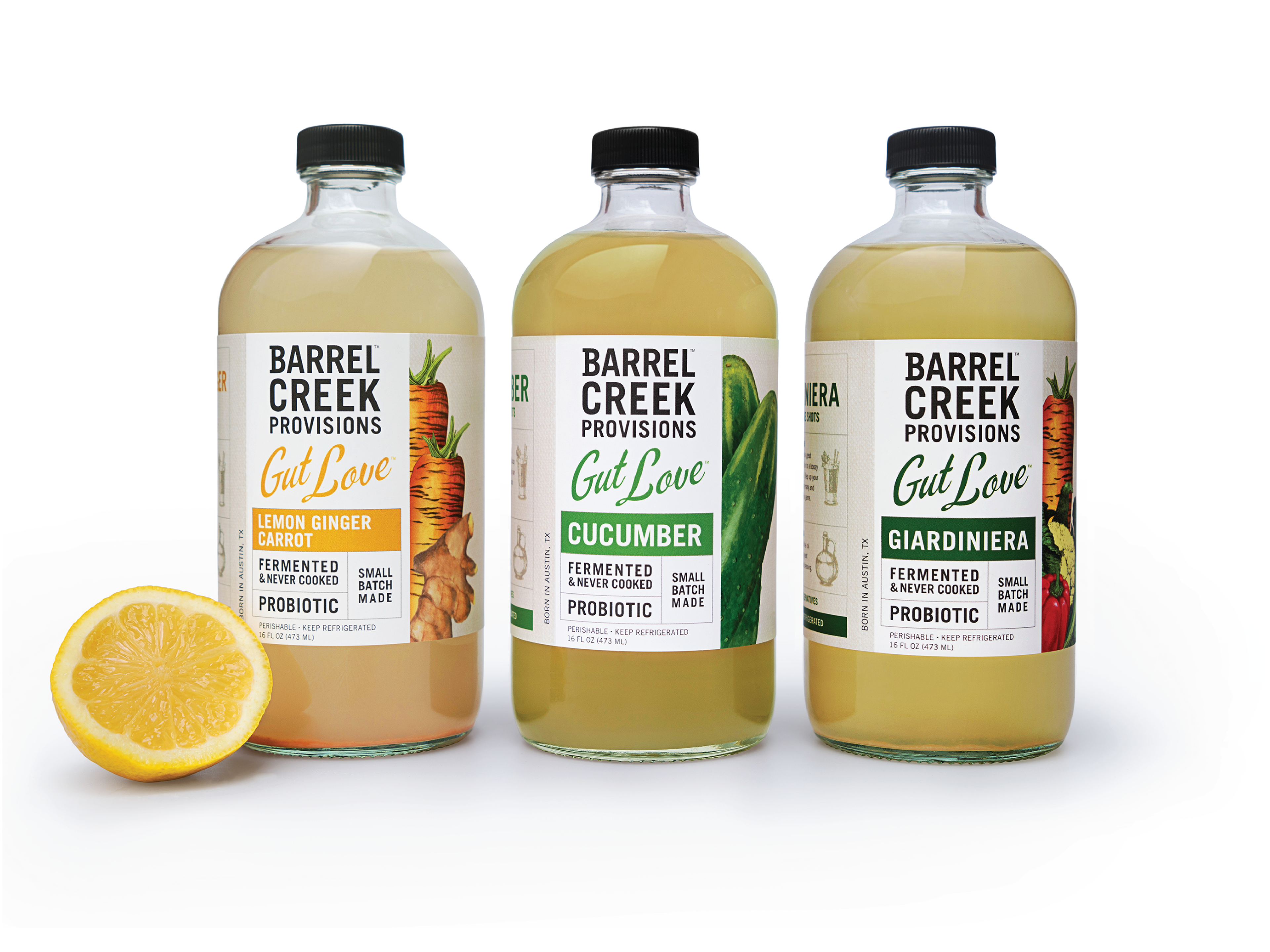
The goal was to make the product feel immediately natural, nutrient-rich, and distinctive on shelf.
The goal was to make the product feel immediately natural, nutrient-rich, and distinctive on shelf.
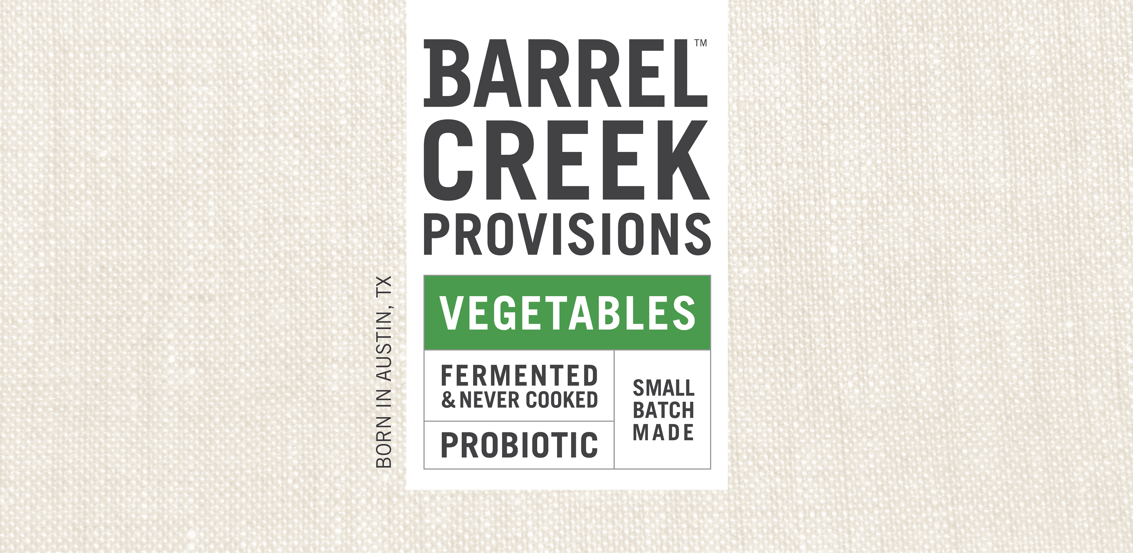
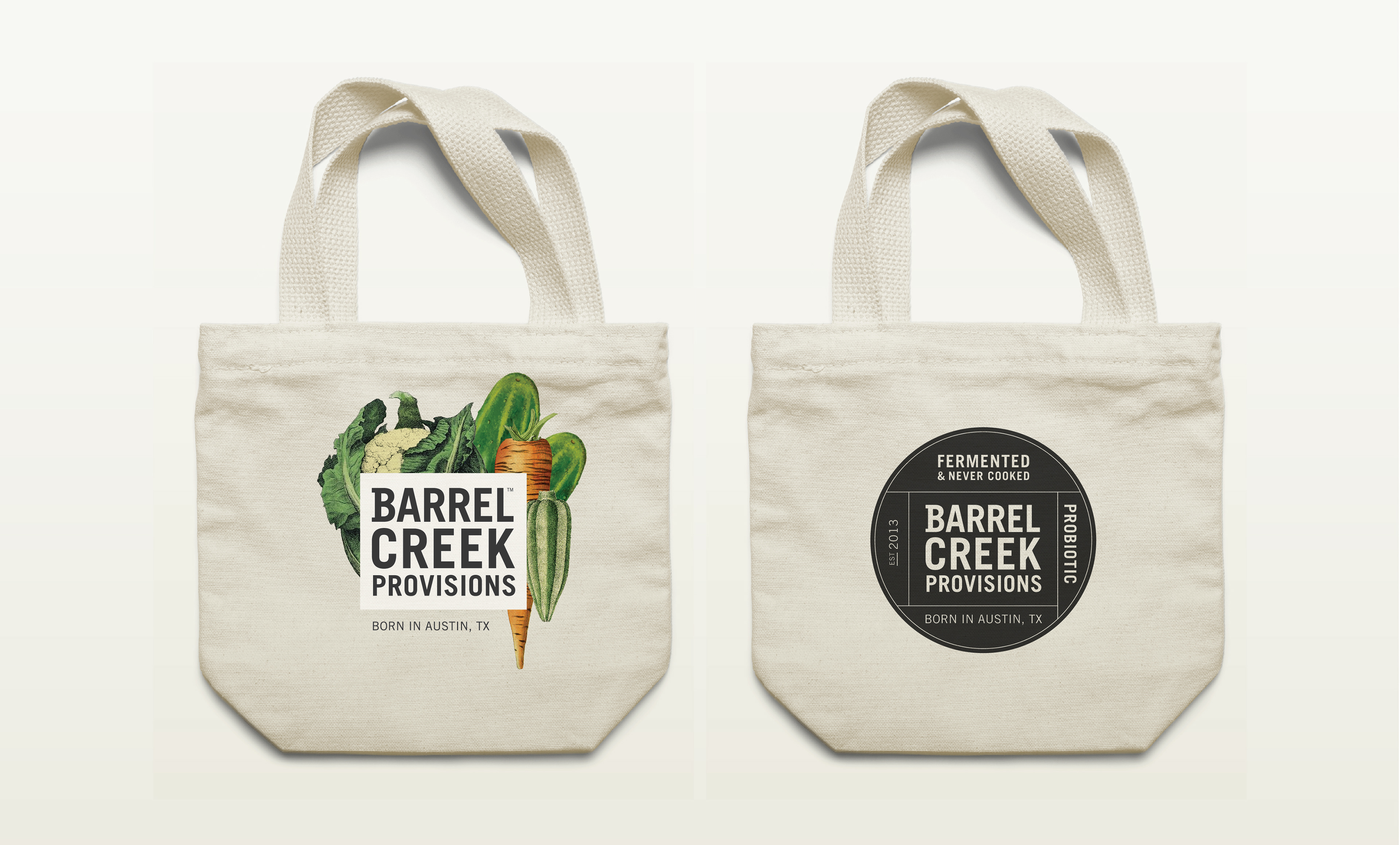
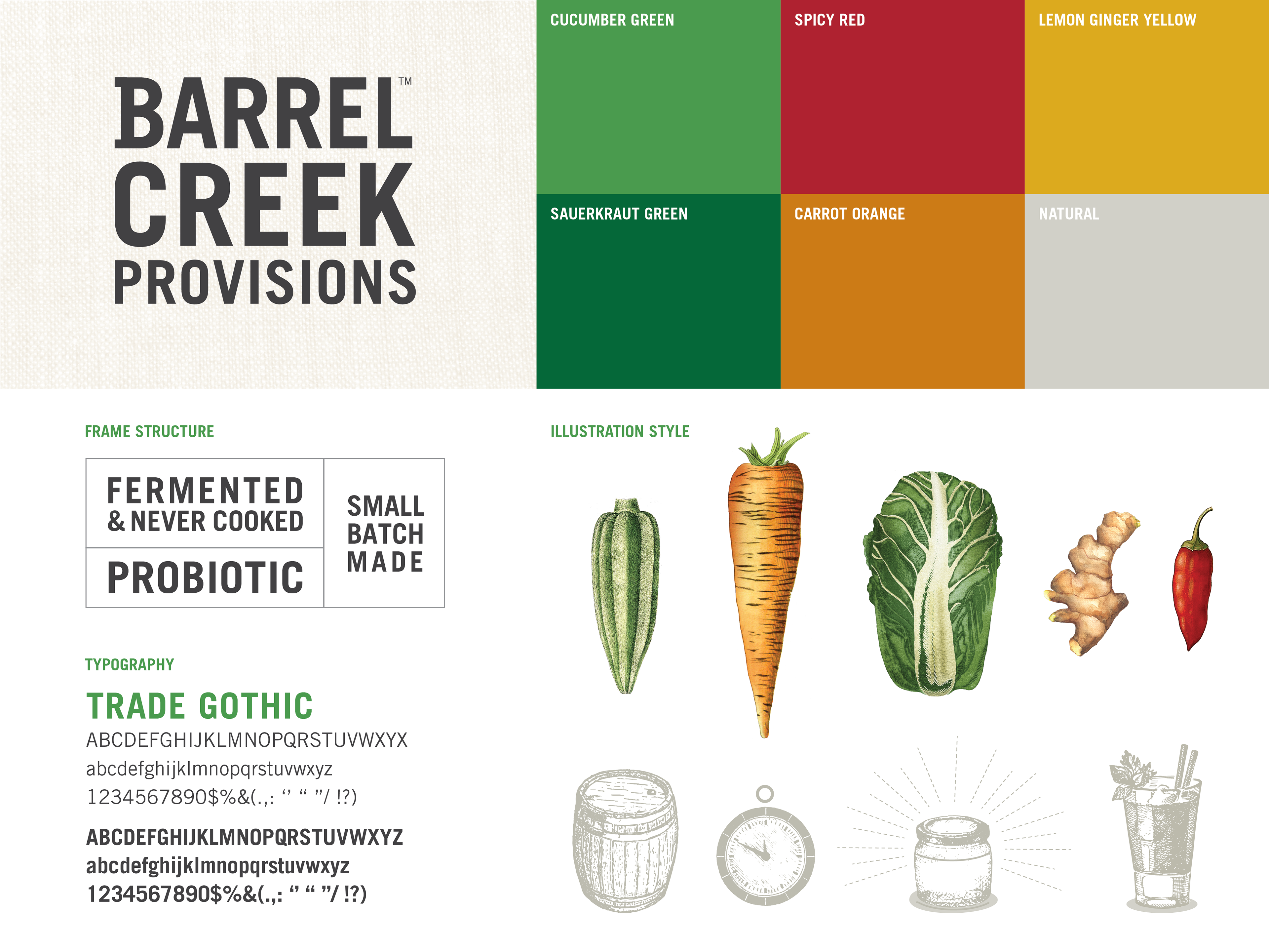
The name drew inspiration from Austin’s cold freshwater springs and the traditional barrel-pickling process, giving the brand a sense of place and craft.
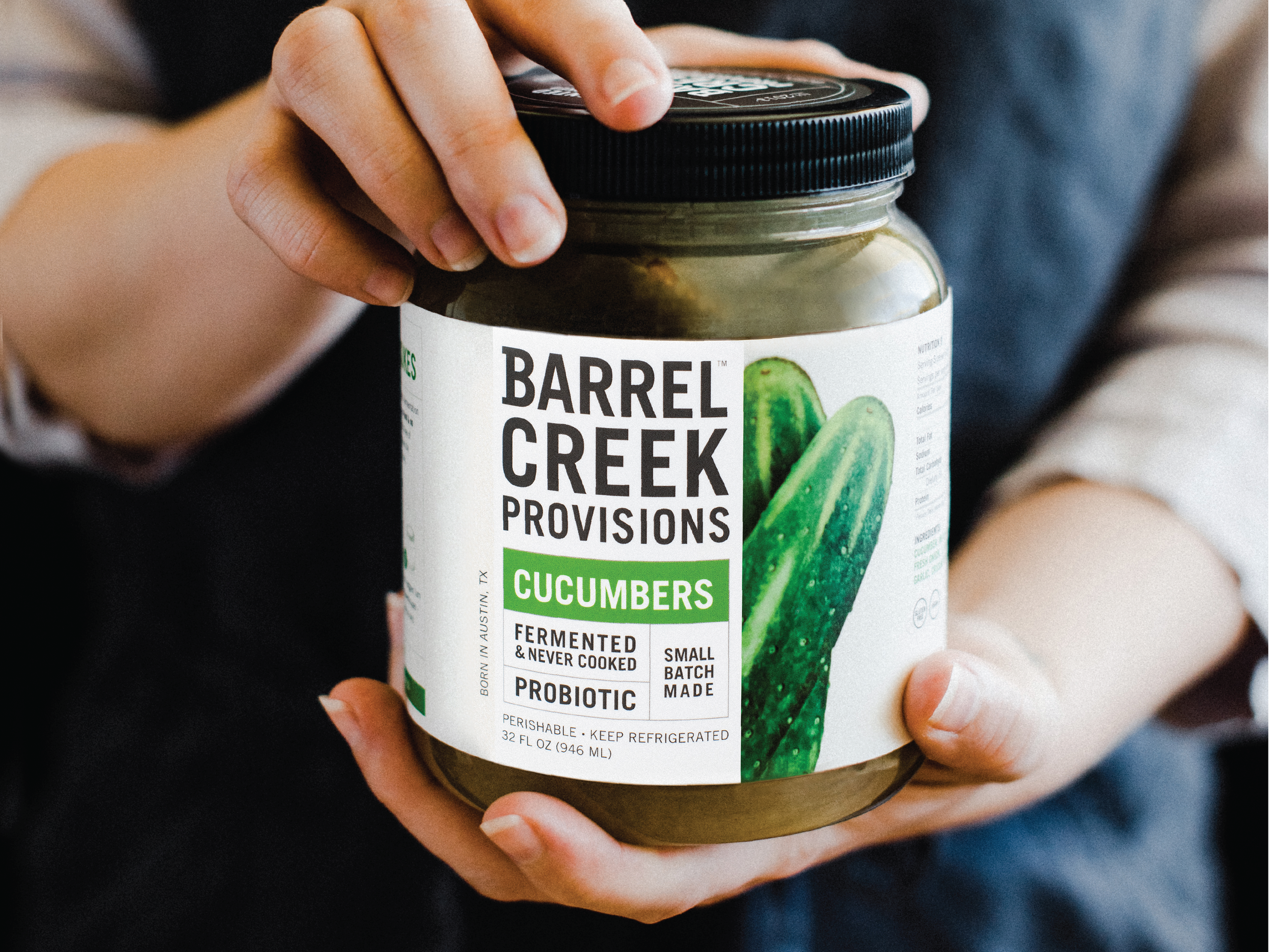
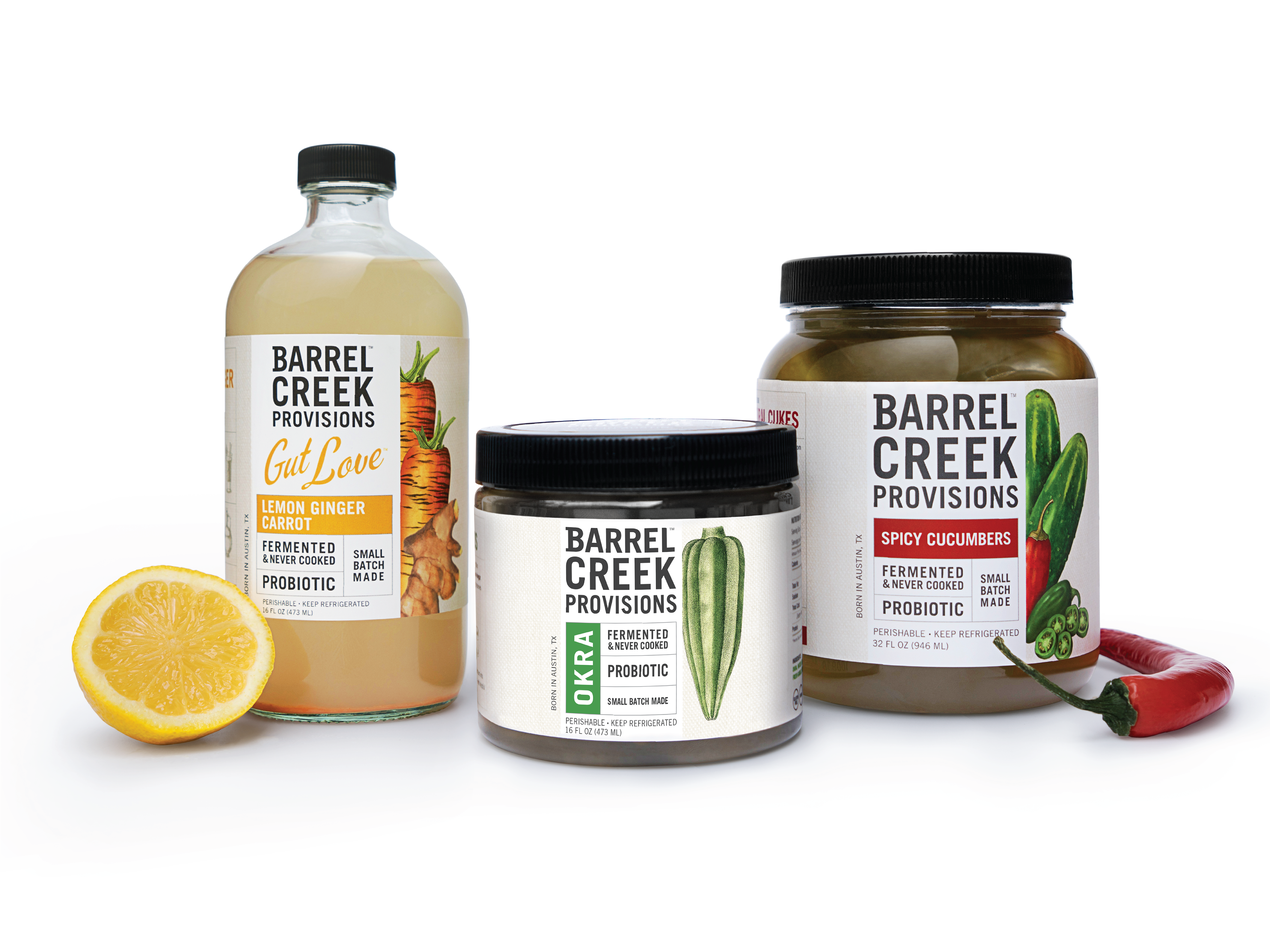
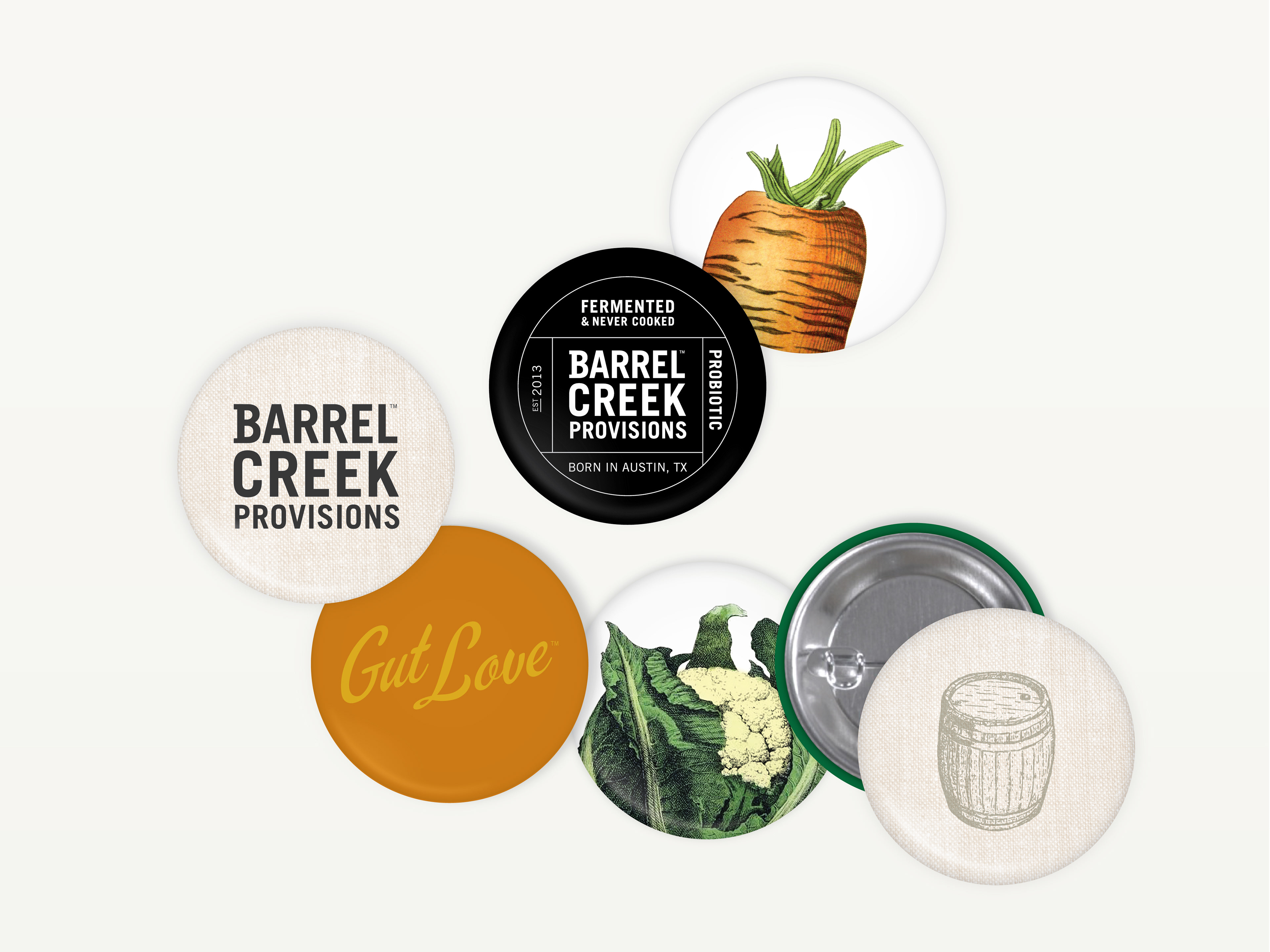
Classic botanical illustrations highlighted the earthy ingredients, while the clean packaging system created clarity, appetite appeal, and strong shelf presence.
“We developed the logotype and packaging design to elevate the Barrel Creek Provisions name in a way that would capture their homegrown identity while providing a fresh, modern take on the farm-to-table concept.”

A' Design Awards
Silver A’ Design Award Winner for Packaging Design by the International Design Academy.
Contact us at info@pencilworx.com