Southwest Airlines
Getting to the heart of one of America’s greatest brands.
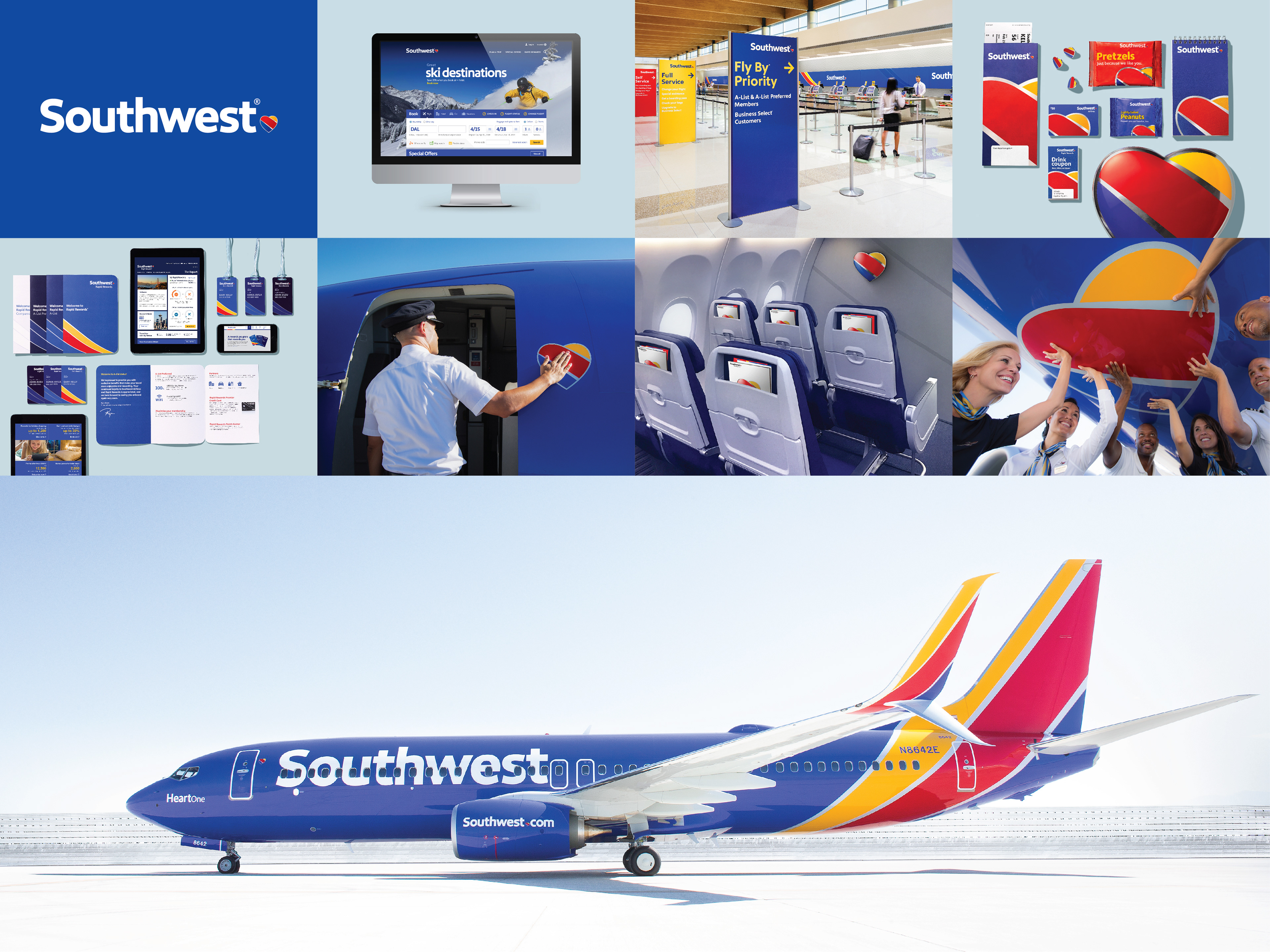
The task was to distill more than 40 years of Southwest’s history into a single modern, impactful look that represents the exciting future of a one-of-a-kind airline.
Getting to the heart of one of America’s greatest brands.
The task was to distill more than 40 years of Southwest’s history into a single modern, impactful look that represents the exciting future of a one-of-a-kind airline.
Avianca
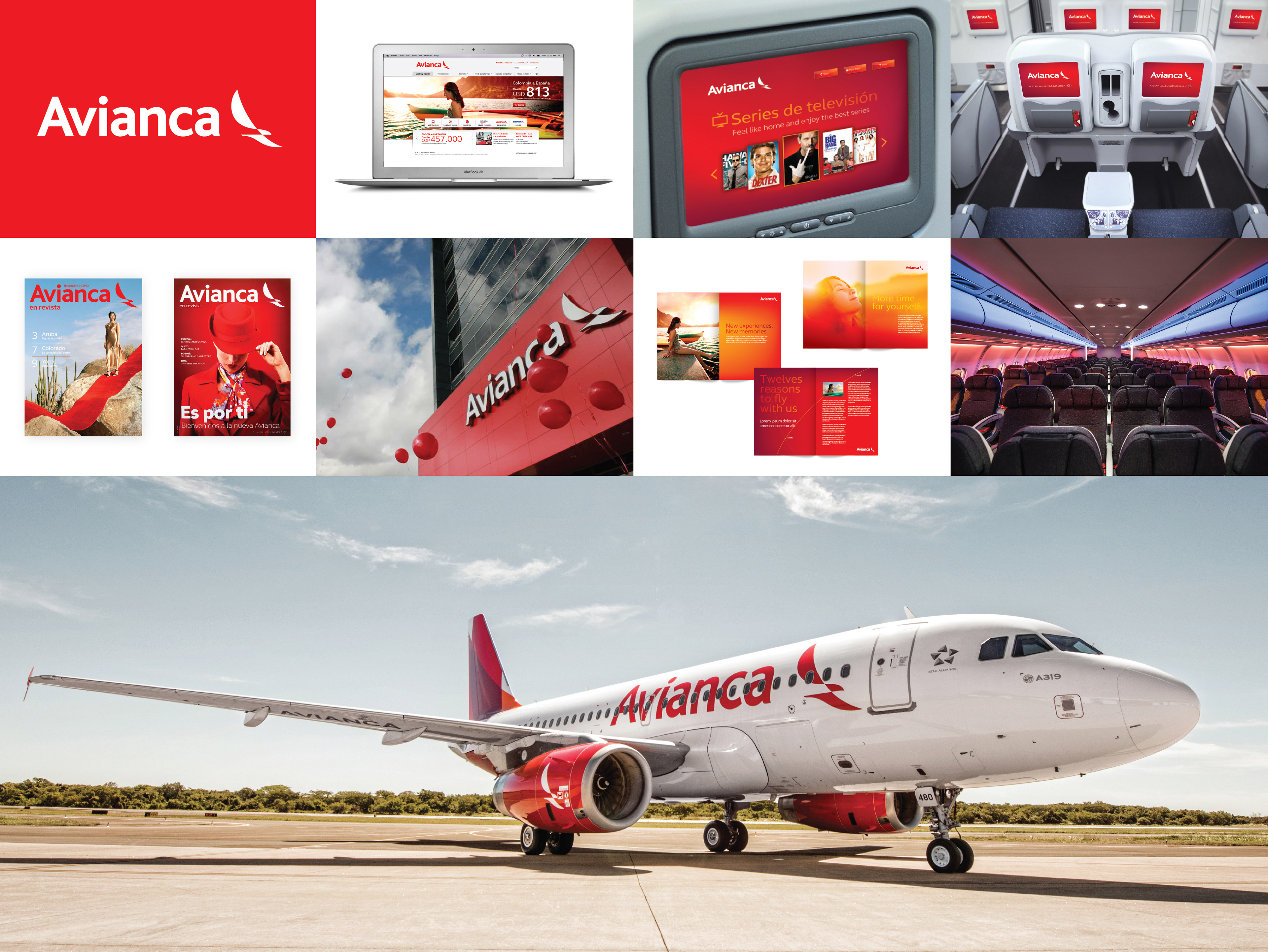
In creating the visual identity, it was important to reflect the heritage and legacy of both Avianca and TACA, but also signal that this is a new, pan-Latin American Avianca. This work included a new logo, brand architecture system, livery, and visual system. The new identity was built on the symbolic power of the Condor, a symbol long associated with Avianca but now in a modern form that figuratively links South, Central, and North America. Additional design elements included aircraft interiors, various mood lighting schemes, and other experiential details that brought the new brand to life.
In creating the visual identity, it was important to reflect the heritage and legacy of both Avianca and TACA, but also signal that this is a new, pan-Latin American Avianca. This work included a new logo, brand architecture system, livery, and visual system. The new identity was built on the symbolic power of the Condor, a symbol long associated with Avianca but now in a modern form that figuratively links South, Central, and North America. Additional design elements included aircraft interiors, various mood lighting schemes, and other experiential details that brought the new brand to life.
STANLEY
Performance in Action
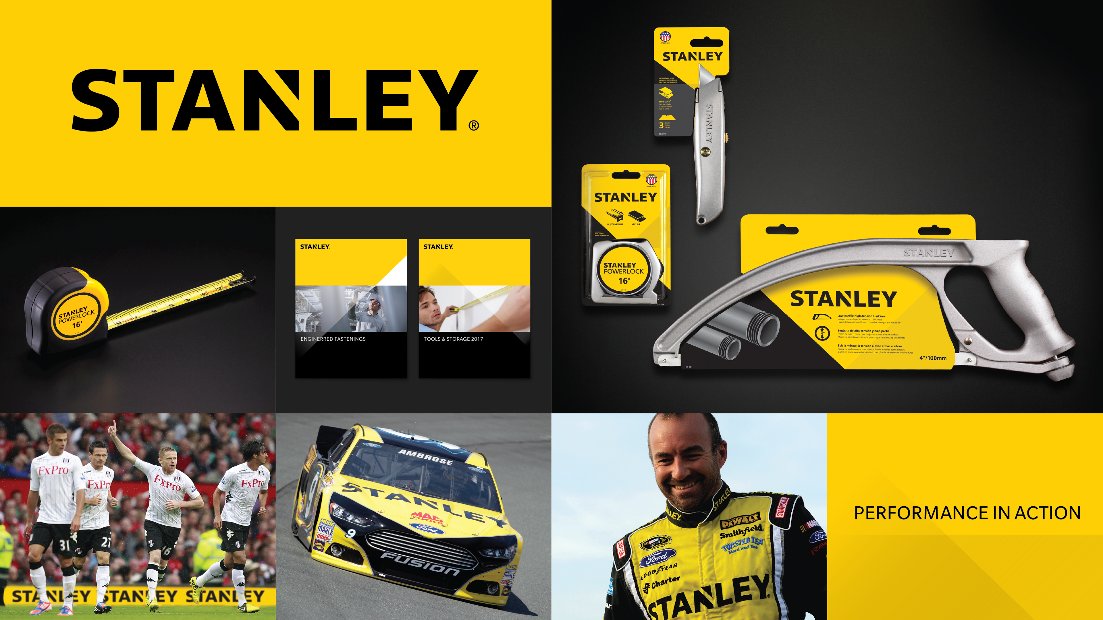
The new visual identity is grounded in Stanley’s rich heritage while simultaneously signaling the brand’s new direction. The new logo is more dynamic; it frees the Stanley name from its holding shape while maintaining the "notch" concept with an angular cut to the letter 'N' at the center of the word. The resulting shape is an upward arrow-like triangle that speaks directly to this concept of "action.” Finally, the logo maintains the signature Stanley yellow and black palette that is universally synonymous with the brand.
Performance in Action
The new visual identity is grounded in Stanley’s rich heritage while simultaneously signaling the brand’s new direction. The new logo is more dynamic; it frees the Stanley name from its holding shape while maintaining the "notch" concept with an angular cut to the letter 'N' at the center of the word. The resulting shape is an upward arrow-like triangle that speaks directly to this concept of "action.” Finally, the logo maintains the signature Stanley yellow and black palette that is universally synonymous with the brand.
Contact us at info@pencilworx.com